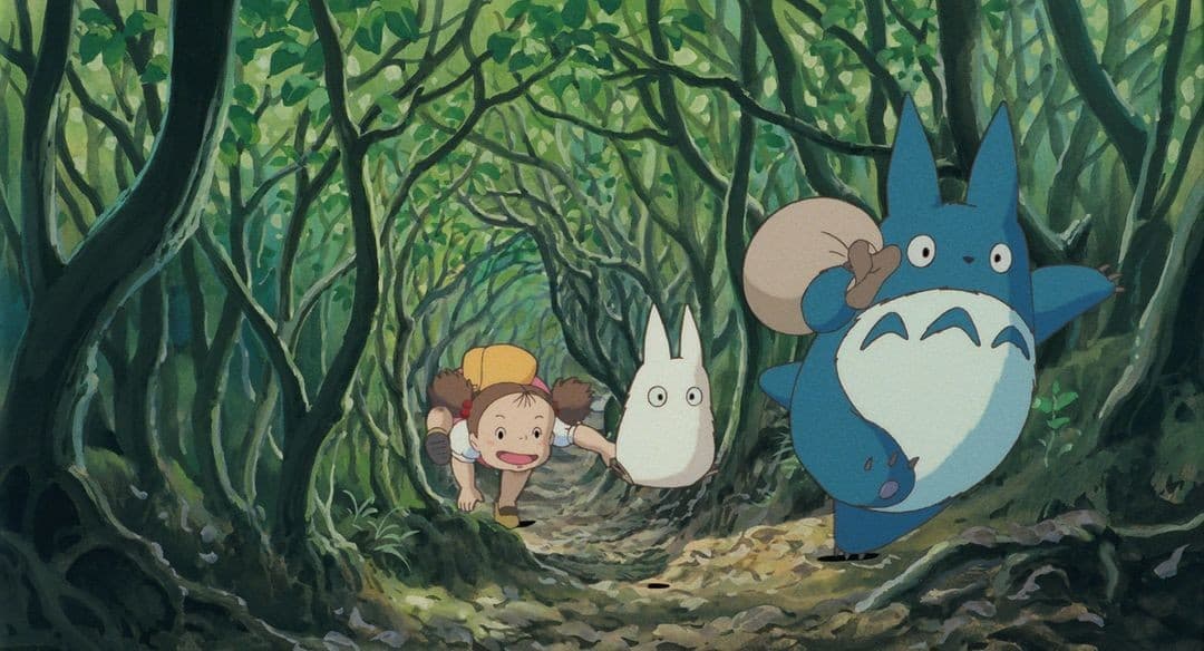
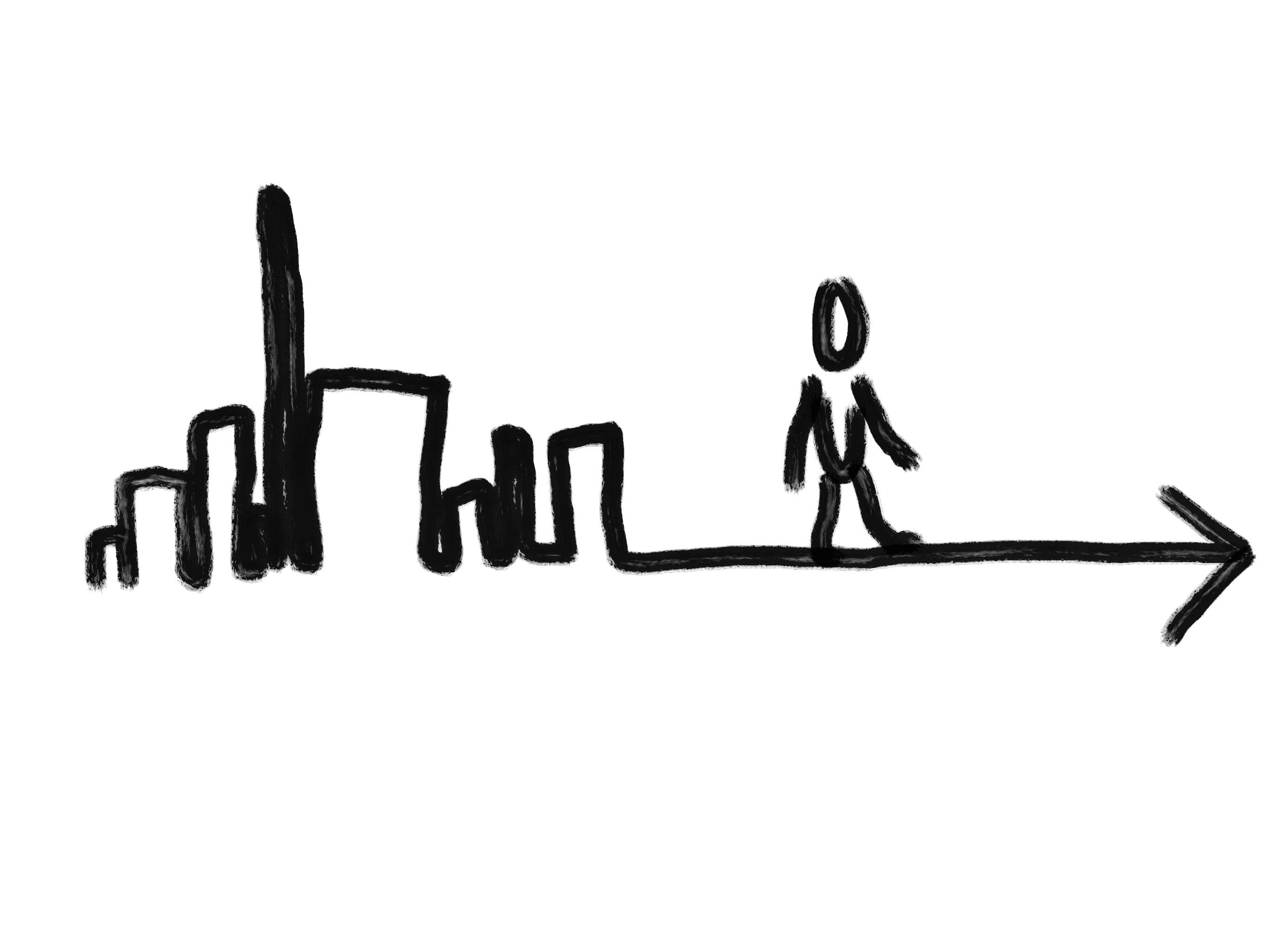
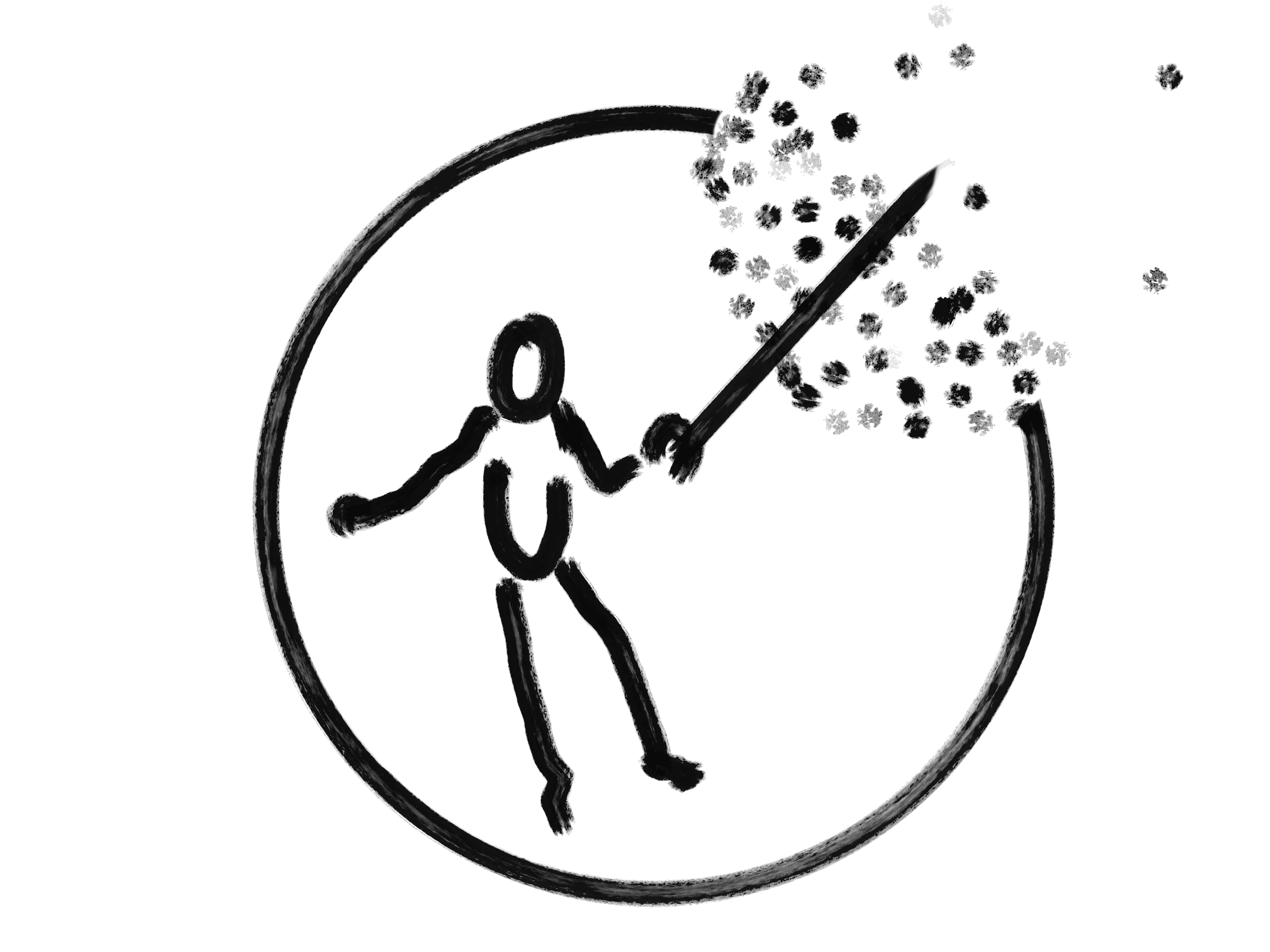
In Miyazaki’s Nausicaä of the Valley of the Wind, the heroine moves without effort guided by her glider, the wind, her intuition, her memory. Sam in Death Stranding follows the same instinct: almost animal, alert to the environment, aware like prey.
I had no glider or odradek. I didn’t follow the wind or BB. So I walked…
Almost climbed.
I can’t answer why we move. But as a designer, I can ask how.
Three things, really:
A means of transport — car, legs, shoes.
A support — bag, trunk, suitcase, pockets, anything close to the body.
An orientation tool — a map, someone, a distant landmark.
I set out to think about all three.
But the means and the support, humanity has done a fine job already.
The orientation tool is where I felt the gap during my journey.
The contemporary orientation tool is Google Maps. Or one of its variants. It holds a near-monopoly on online cartography and navigation.
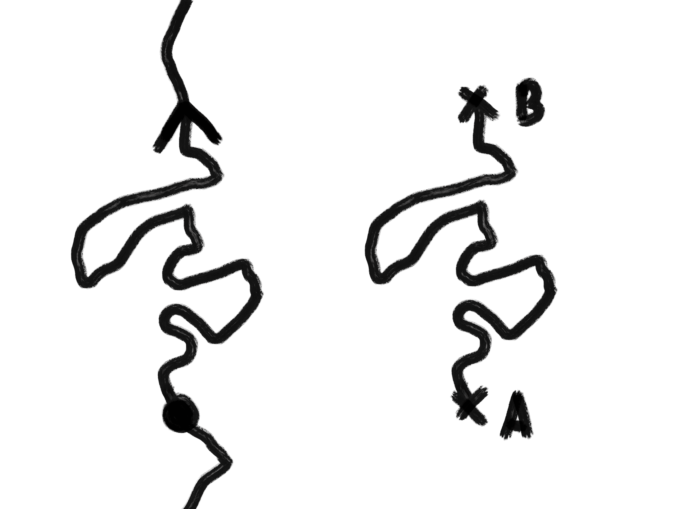
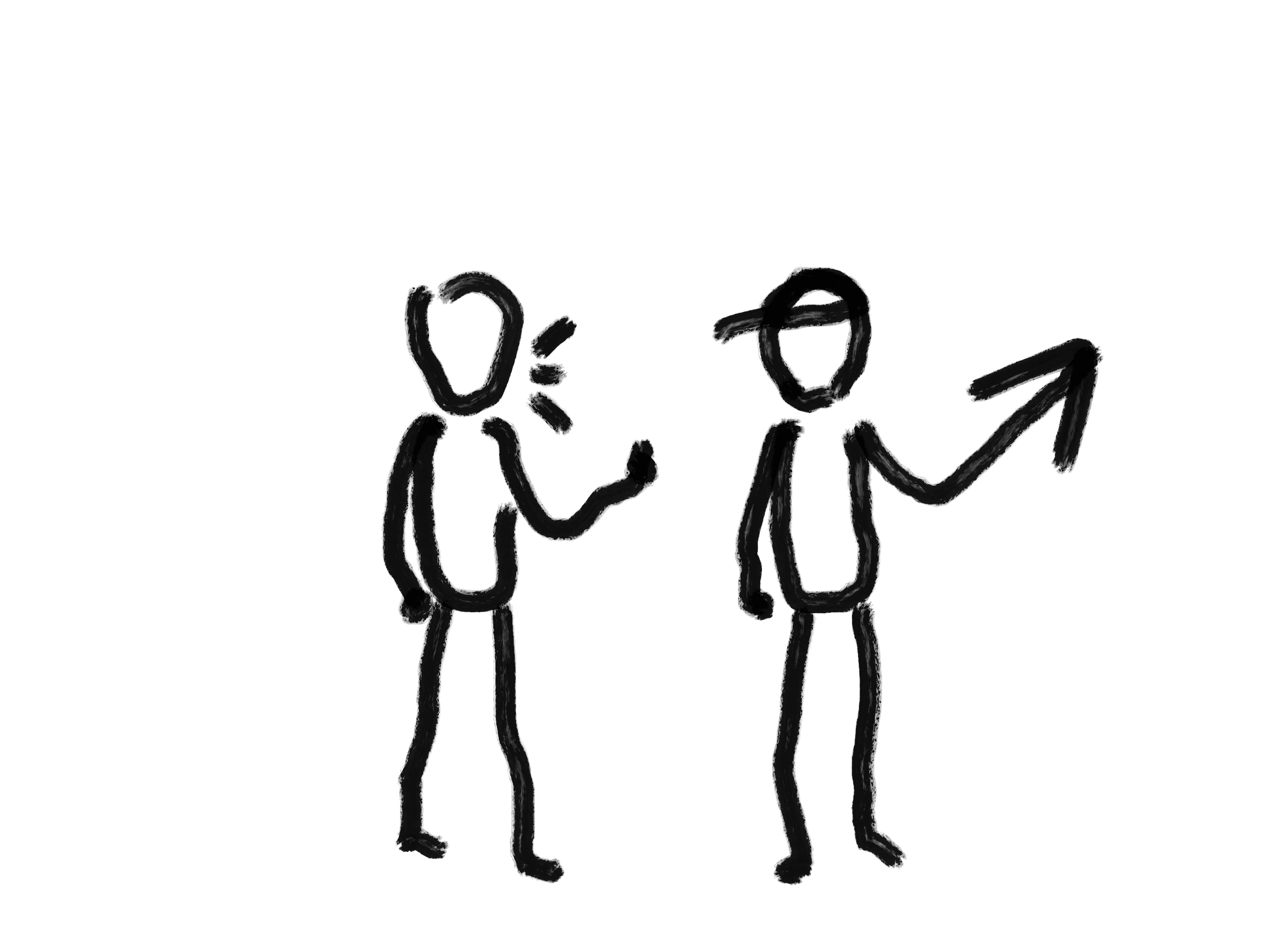
And yet — Maps wasn’t really missed in the places I traveled to. San Francisco’s grid streets are easy to read on their own. But once you try to wander off the beaten path: nothing. In other countries: their own systems, opaque or blocked for a foreigner. So you depend on someone, or on chance. Sometimes, no signal. Outdated offline maps. Productive drift.


Three things bother me about this tool.
It’s too utilitarian. So it’s rigid. Three options that are almost identical, and we always pick the shortest. What’s the point of twelve versus nine minutes? We time it to the minute, glued to the blue line. Stray from it, and you feel wrong.
It overwhelms. It paralyzes. We just want to eat, and we drown in reviews. Like in front of the Netflix catalog. We scroll endless ratings. We don’t go anywhere rated below 4.7 stars, for no reason. Everyone goes there. The places aren’t even that good. It creates over-tourism. Meanwhile, we swipe between apps. Check Instagram, watch a story, reply to a message, an email. We forget the trip itself. If we imagined teleportation as the future of moving, the question of the trip becomes even more present.
It can even waste time. A bike route going against traffic when I could just turn earlier in the right direction. In Korea, places I couldn’t reach because there was no path on the app and I assumed there was no path in real life either. We end up thinking a place is inaccessible. So it’s not a tool for exploration.

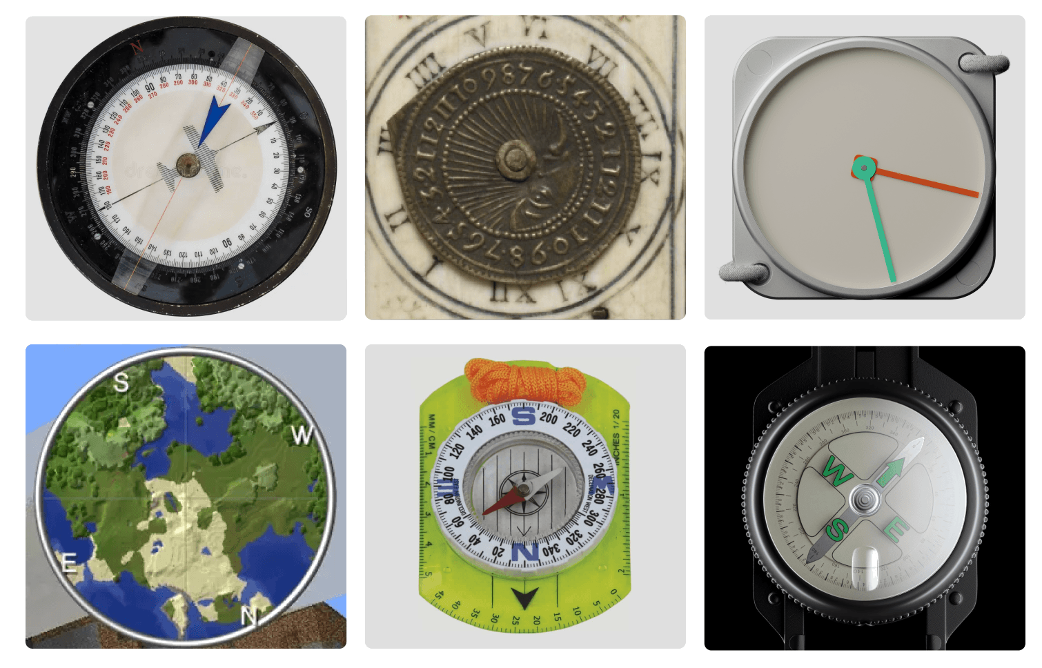
There’s another orientation tool I kept thinking about. Almost the opposite of Google Maps. The compass. Even if it’s outdated outside very specific contexts. A return to my very first project, where I asked similar questions.
In my non-use of Maps, while traveling, I found many desirable experiences. I’d like to bring them back into everyday life.
Freedom of movement. Cities are designed for the map, not for the human. The desire paths worn through the grass prove it.
Taking time — not as in running late, but as in being present.
Moving with the flow of wanting.
Owning the trip. Being active. Not waiting for the destination
— or, on the contrary, accepting the surprise. Like that night in the middle of Jeju island, around midnight, no GPS, when I met this woman.
Baudrillard wrote that the map precedes the territory. Today the world is made of addresses and names — a nomenclature. We even draw borders with a ruler.
How do you describe a place with no name, no address? It’s made of warmth, a yellow field, a smell. I want to search for places by their adjectives, their qualities. Not by keywords decided by someone else.
Places are made of matter, but also of people.
I wanted it to be rooted in our time.
The question is not to invent a new technology. It’s a question of posture. The way, in my own work, I’ve used a tool meant for A to do B.
How can I turn my enemy Google Maps into an ally?
And then there’s AI. I want to give it a body. It mostly speaks through images, text, voice. I want it to speak through a body.
For our interaction with it to feel natural — like a companion, human or otherwise — it has to be touching, reassuring. So we don’t distrust it.
Reassured, we can venture out. Ask open questions. Stop being a consumer, become an actor. Express our deeper desire. Make an effort. Be heard. Be understood. Unlike Google Maps.
From these observations, an intention. From the intention, principles to help me draw.
Gives a heading, like a compass — but instead of north, it points to a place. Answers with a direction, not an itinerary.
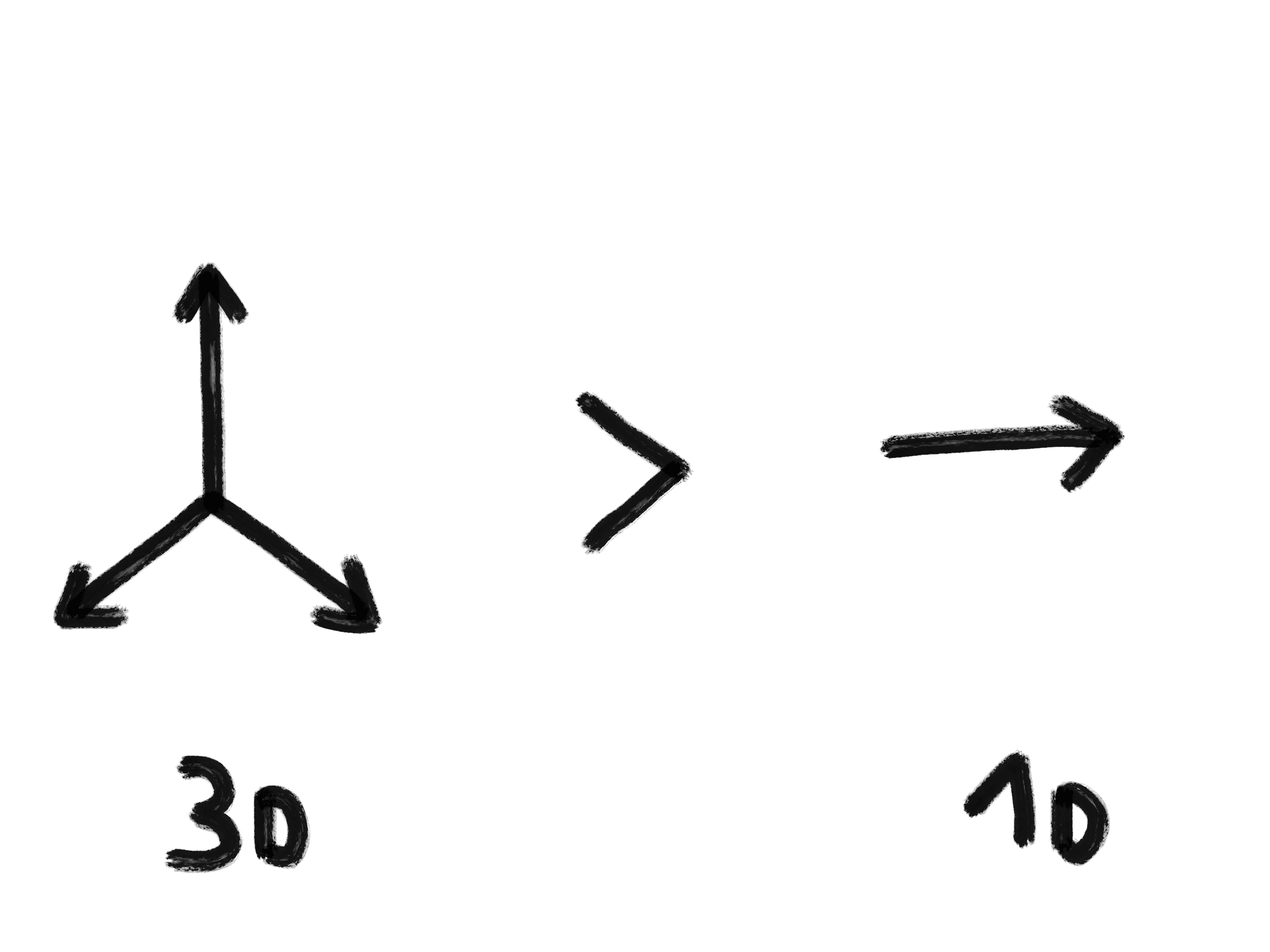
Prioritizes space over time. The temporality — arrival, duration — stays in the background.
Reduces cognitive load. Dedicated to one thing only: moving. Without solicitations. Ultra-readable in the complexity of cities.
Encourages discovery rather than predictability. Open to drift, to detour.
Uses natural language and simple gestures, in motion. Like asking a stranger for directions in the street, and they point.
Lets you qualify your desire — precisely, or vaguely.
Over time, it understands you. You speak to it. You learn to formulate. The more you formulate, the more it understands. Trust grows. These bubbles of desire — you can play with them, stay in them or step out.
A personal product. Made in a contemporary technical context.
I came at the project through use.
The fastest way to apply those principles was to start with software. The iPhone has every component we need. It lives in everyone’s pocket. So we can deploy widely, in real conditions.
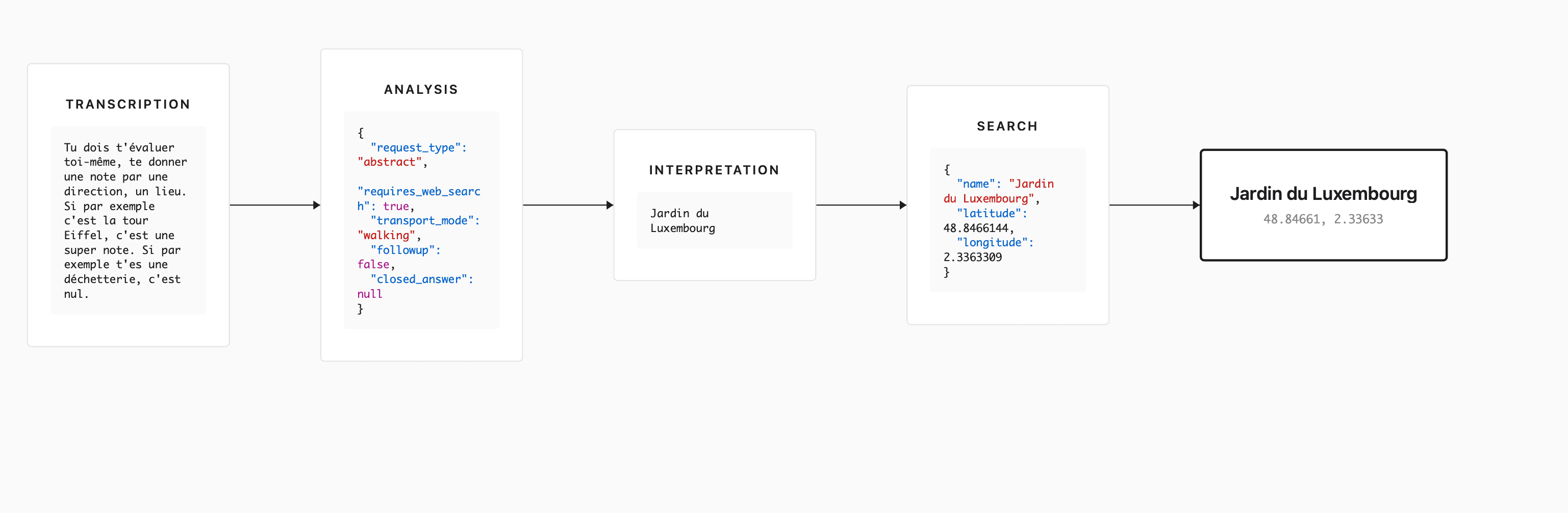
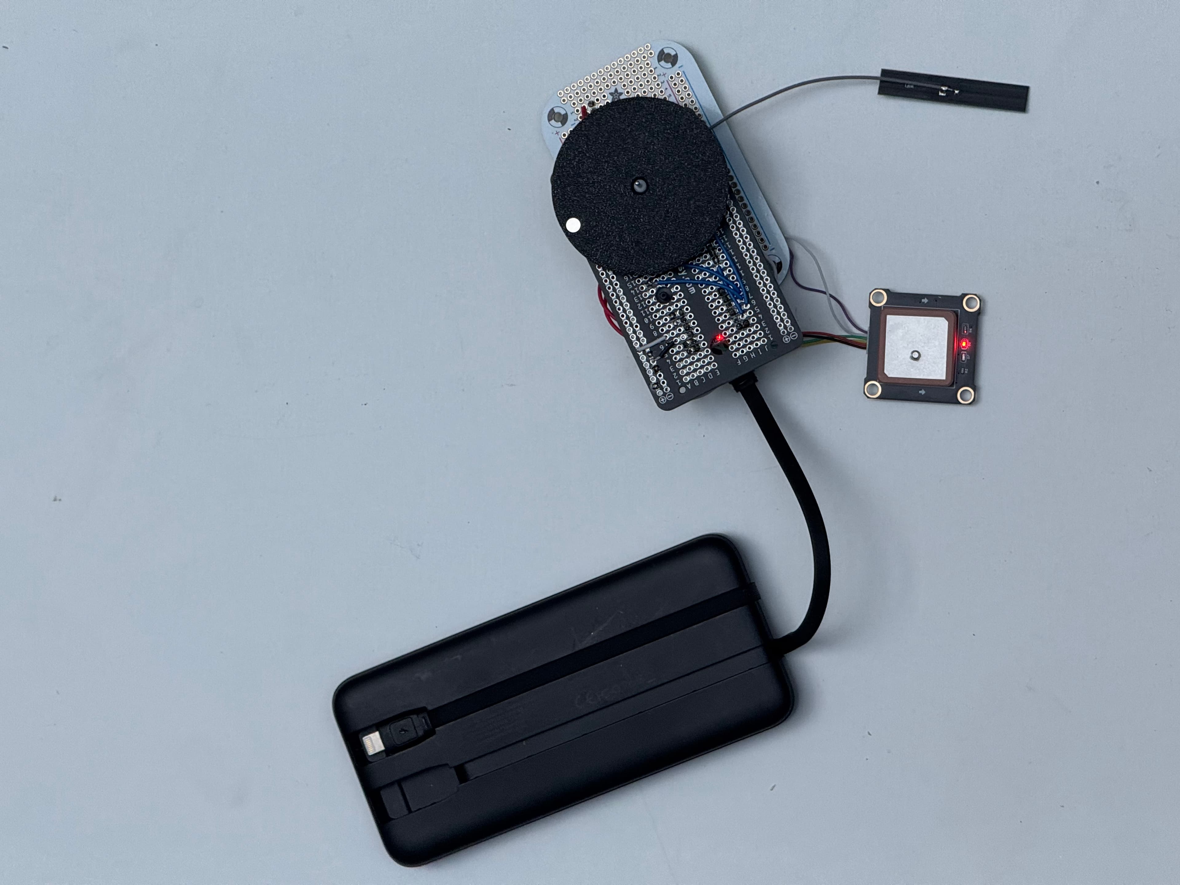
If I say “we”, it’s because I asked Benjamin, a developer, to help me think this system through. We design it together.
We made an app and sent it to about fifty people. We tested it in ten different countries, contexts, languages. We designed a monitoring tool and visualized about a thousand requests, which let us improve how requests are handled.


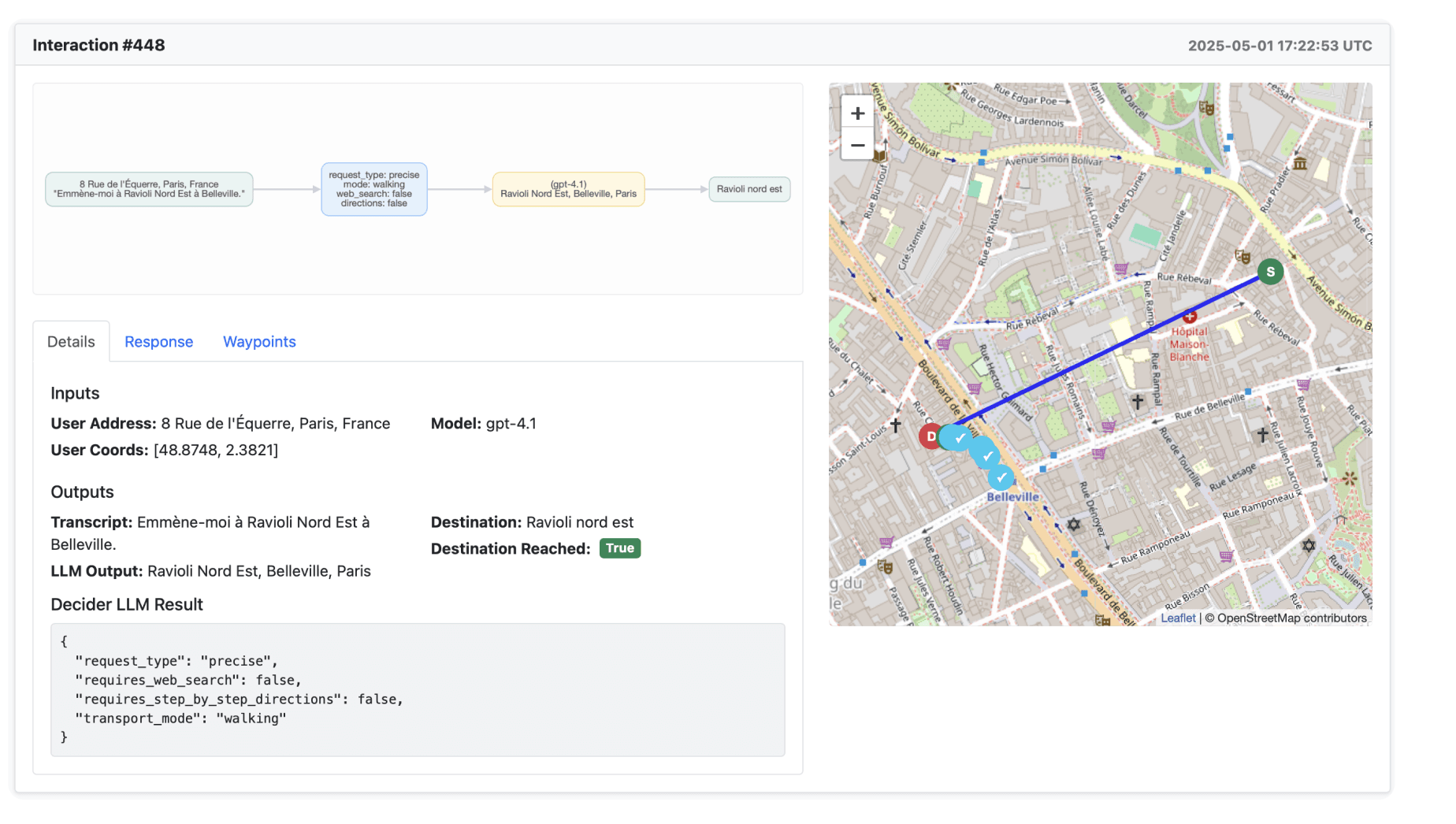
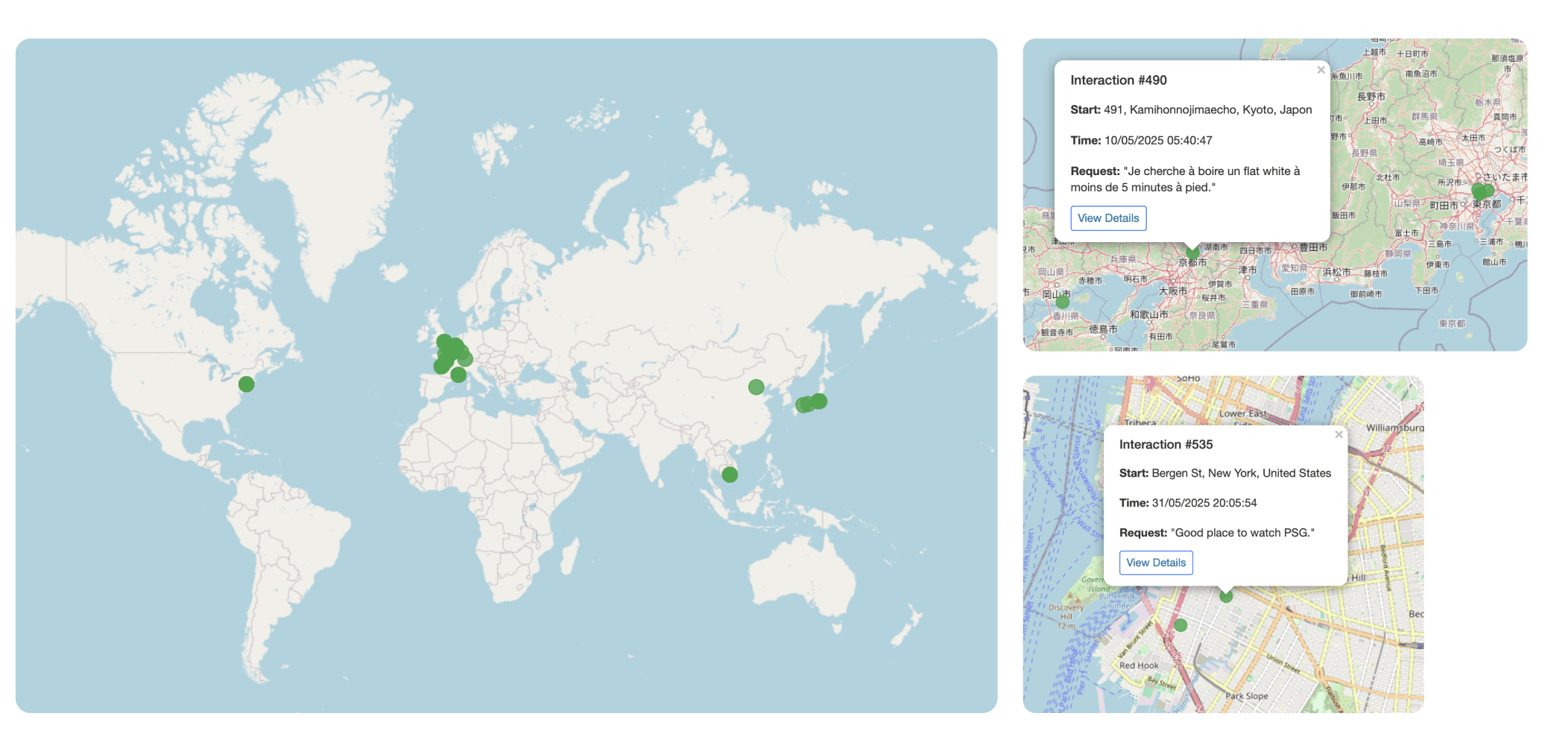
Here’s a sample of the kinds of requests we want to support:
Take me to 190 boulevard de Charonne.I’m looking for a caliper.A bench in the sun nearby.The southernmost point of France.A place to cry quietly.Surprise me.I’m looking for Milo in Milan.
From the most precise, to the vague, to total abstraction.
But remember, this is just a test tool. It has to live in a physical object.
Why a physical object? The pleasure of holding it. A sensitive, sensorial thing. A relationship between touch and direction. Dedicated to one thing only — moving — unlike the iPhone.
Let me show you how it took shape.
The first functional prototype let me actually use it. Like in San Francisco last month. I barely looked at the object in the video, without meaning to — which is a good sign. I was finding my way.
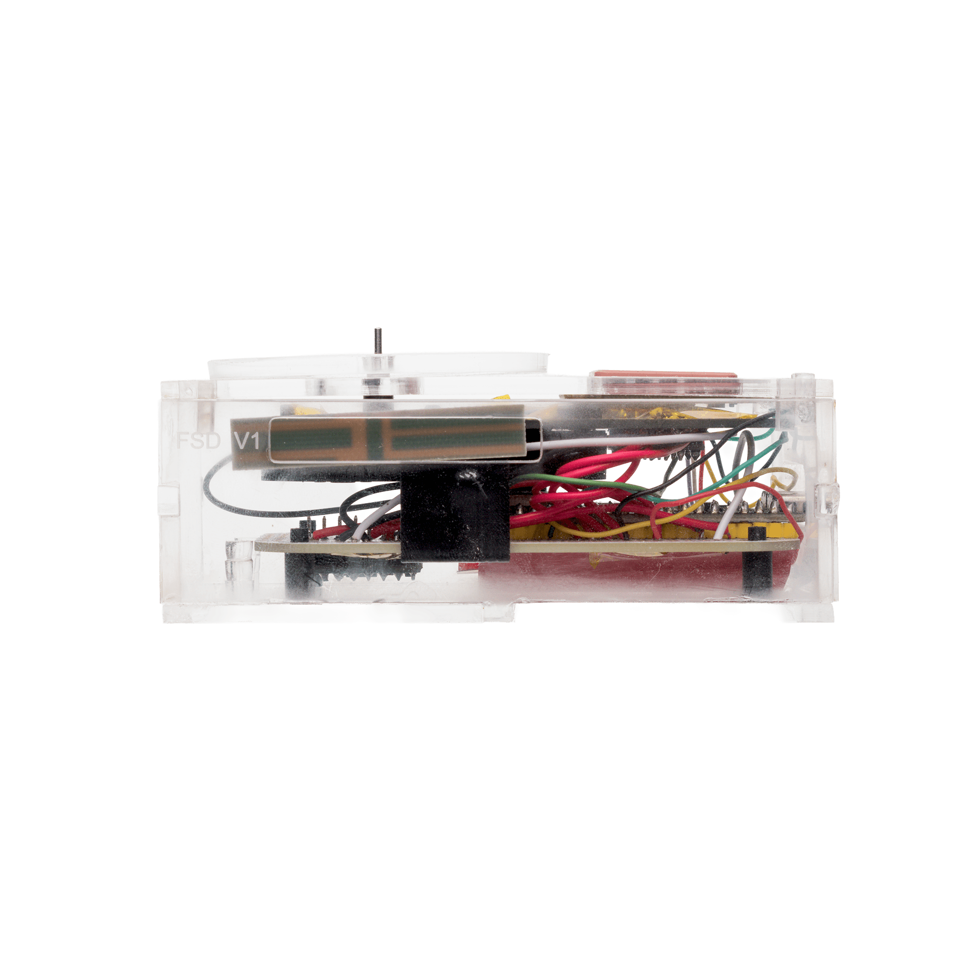
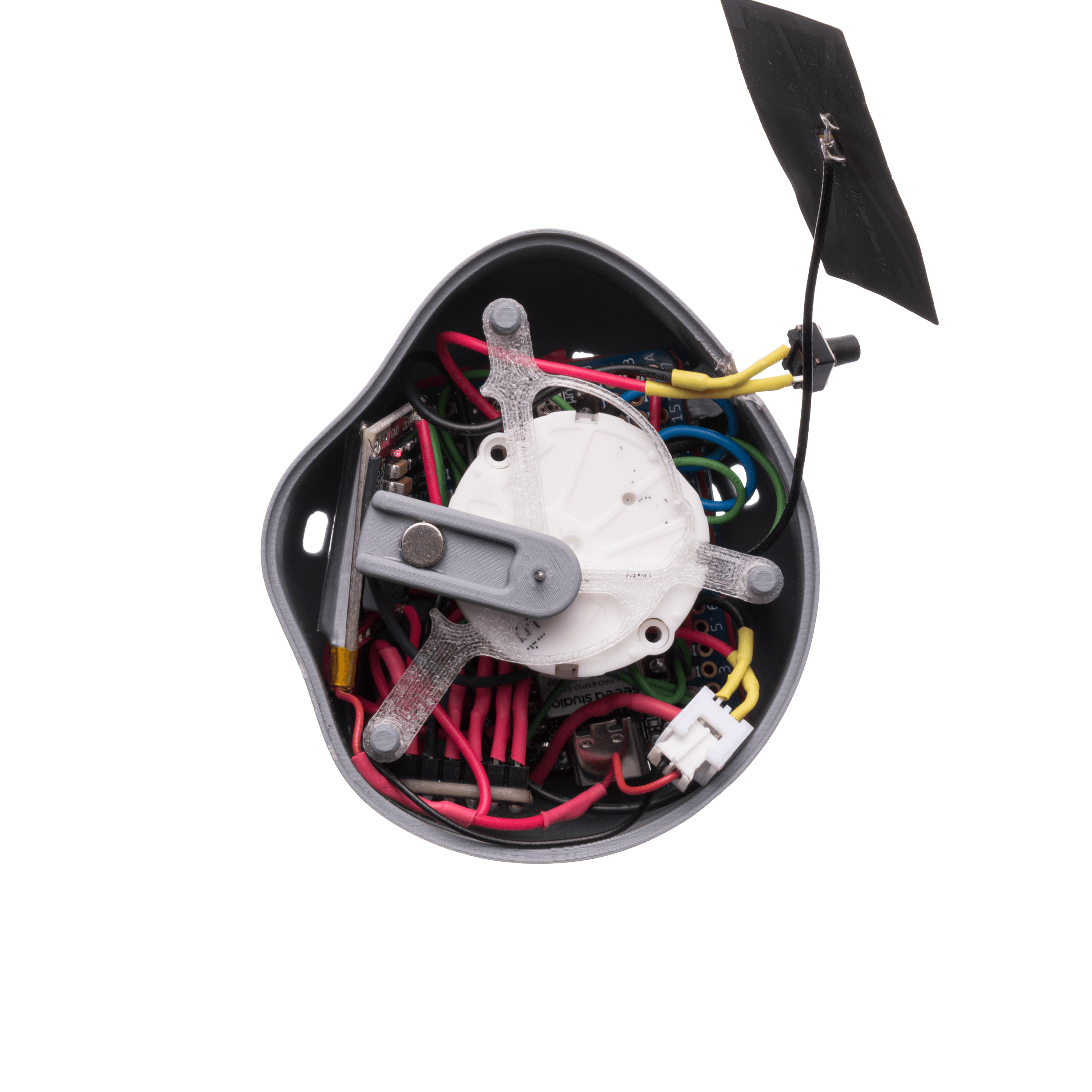
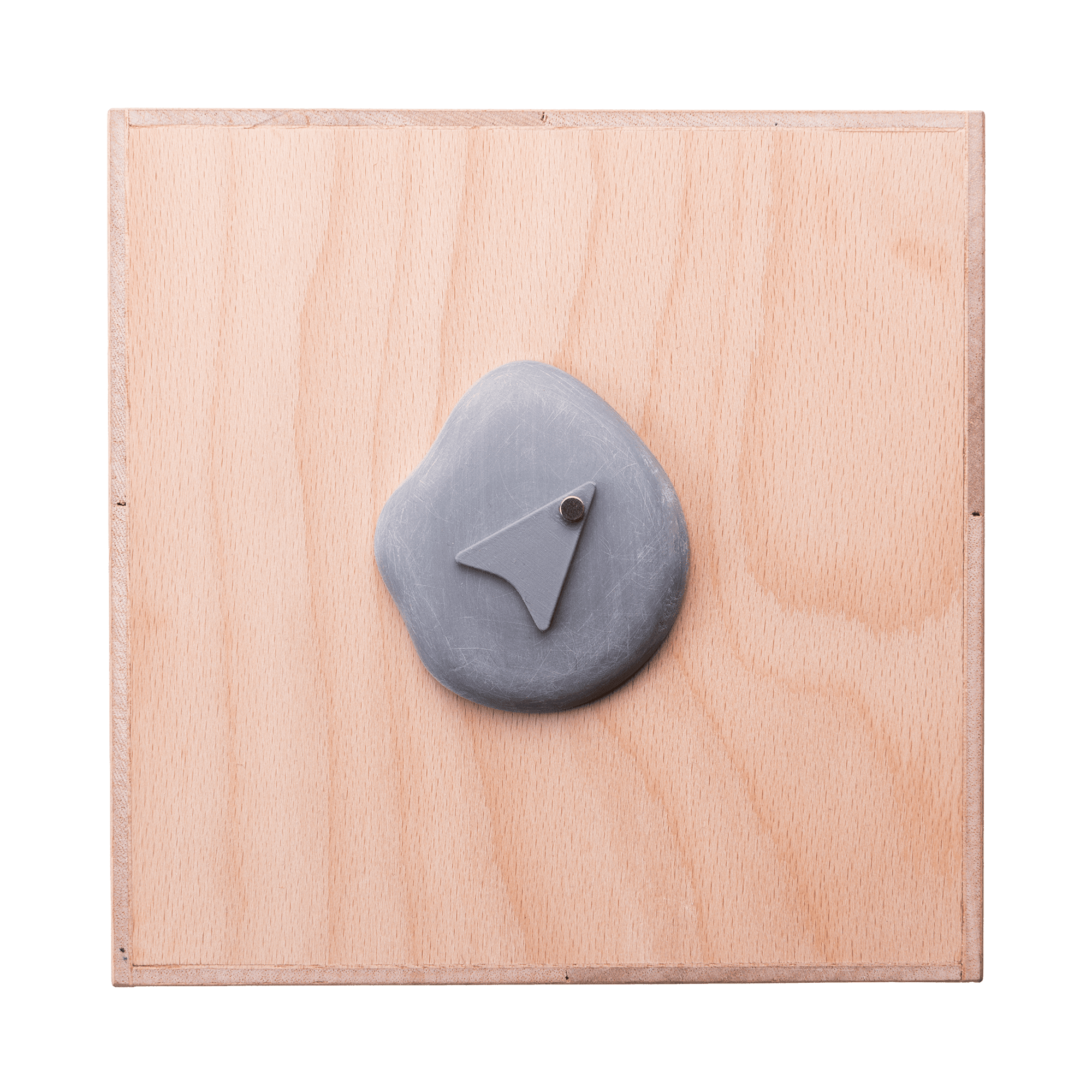
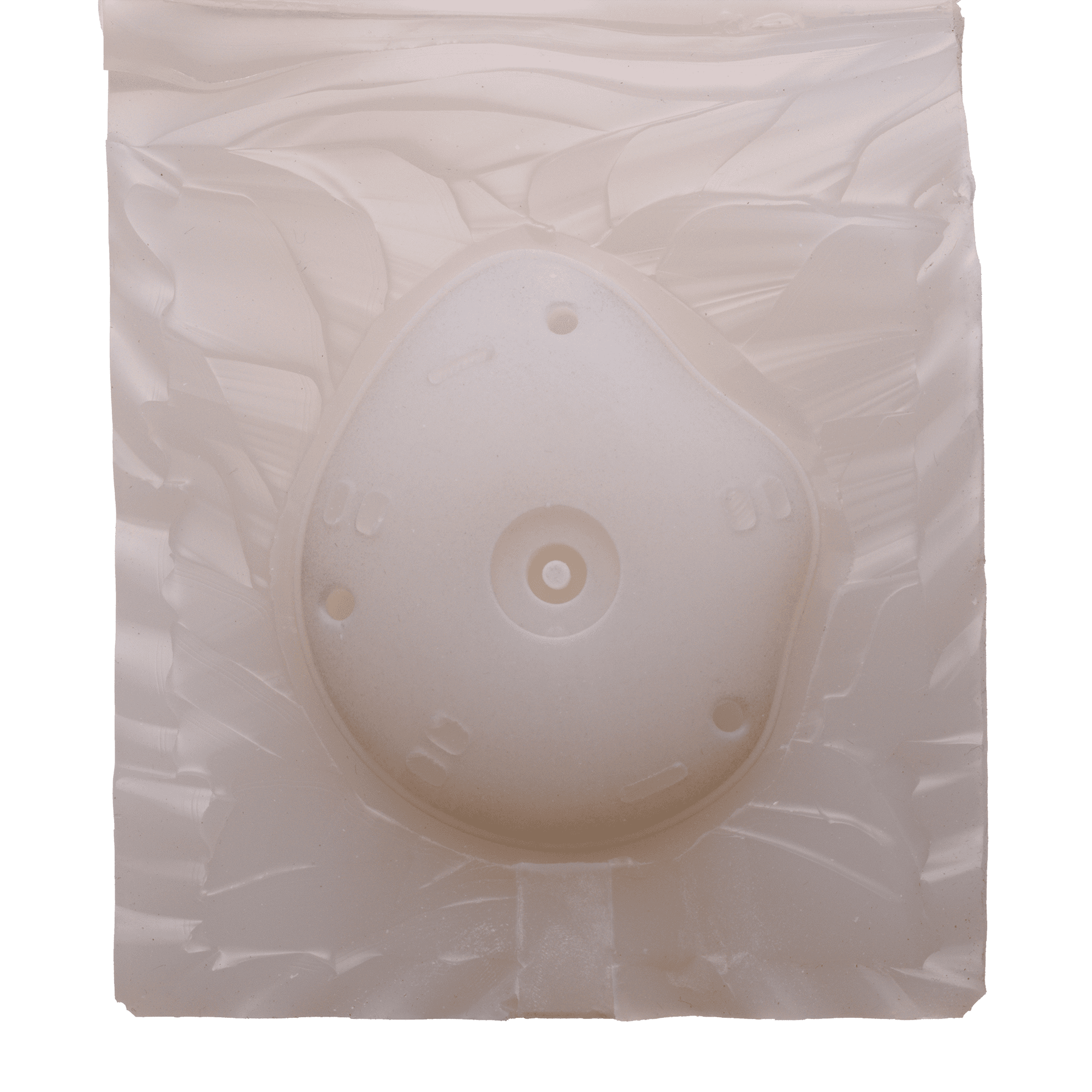
It also let me list the useful components: processor, dual-axis needle motor, motor driver for smoother motion, IMU, GPS for localization. The GPS turned out to be too big and useless indoors — we dropped it. What remained gave the form factor: a volume.
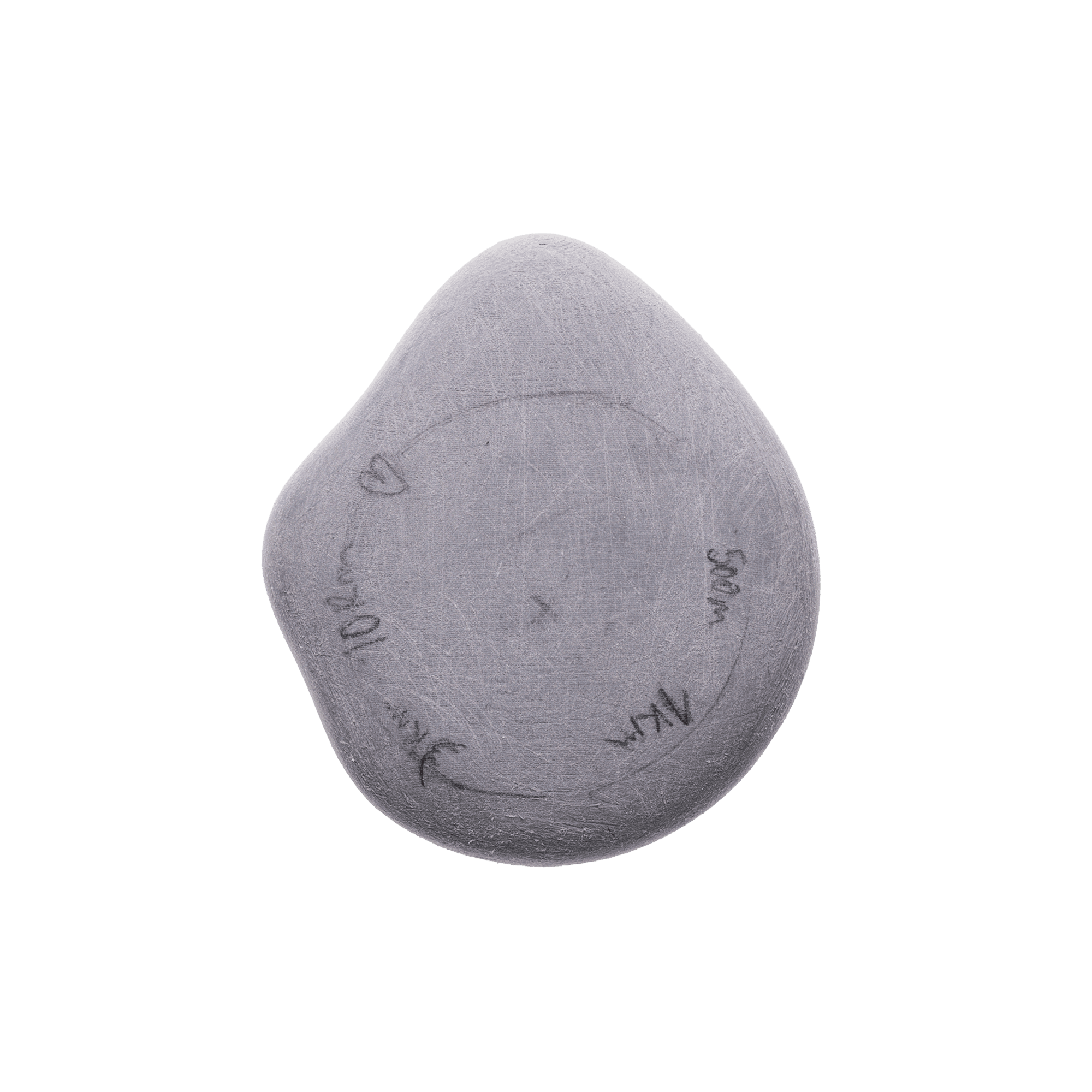
A flat cylinder, but too big at first. It let me draw around it.
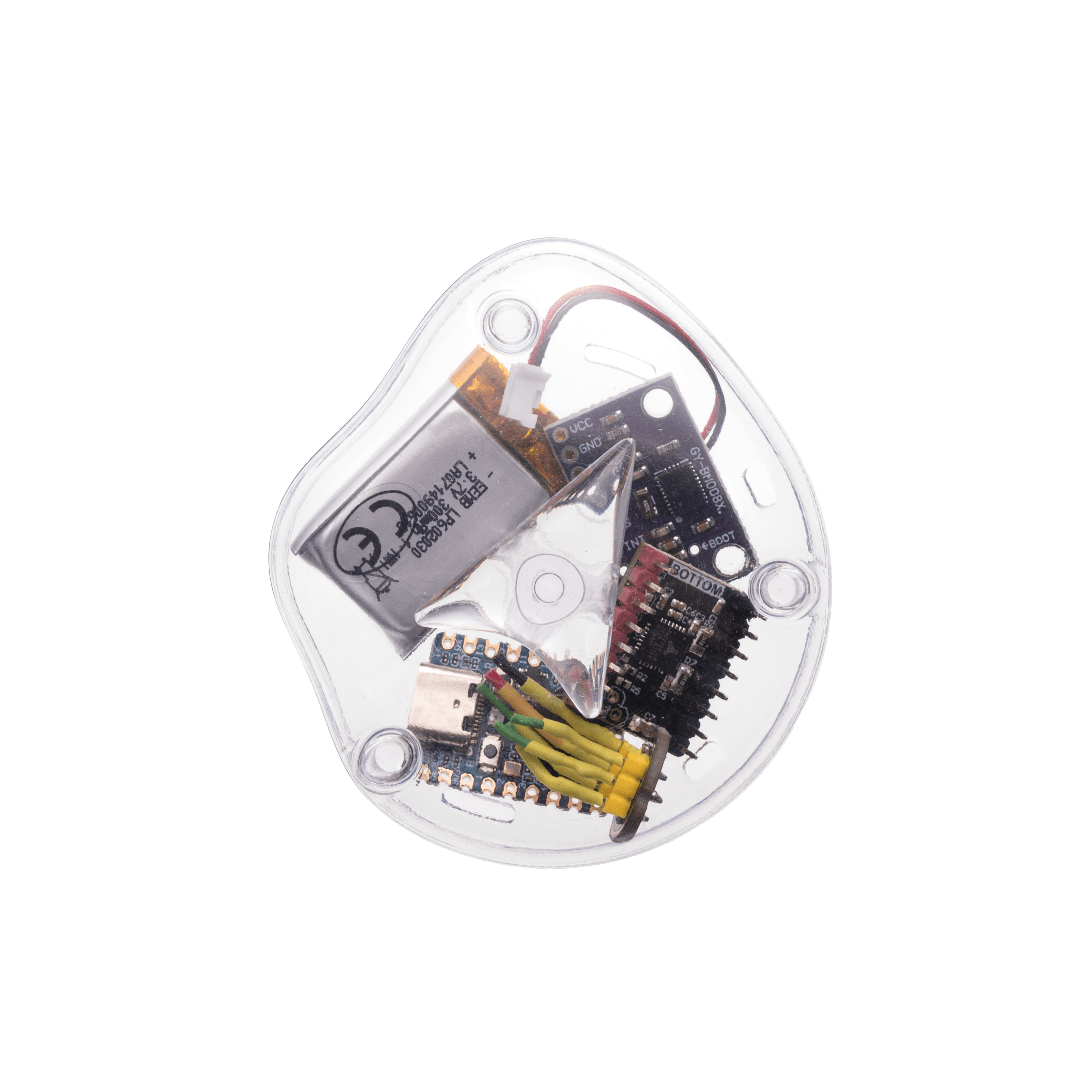
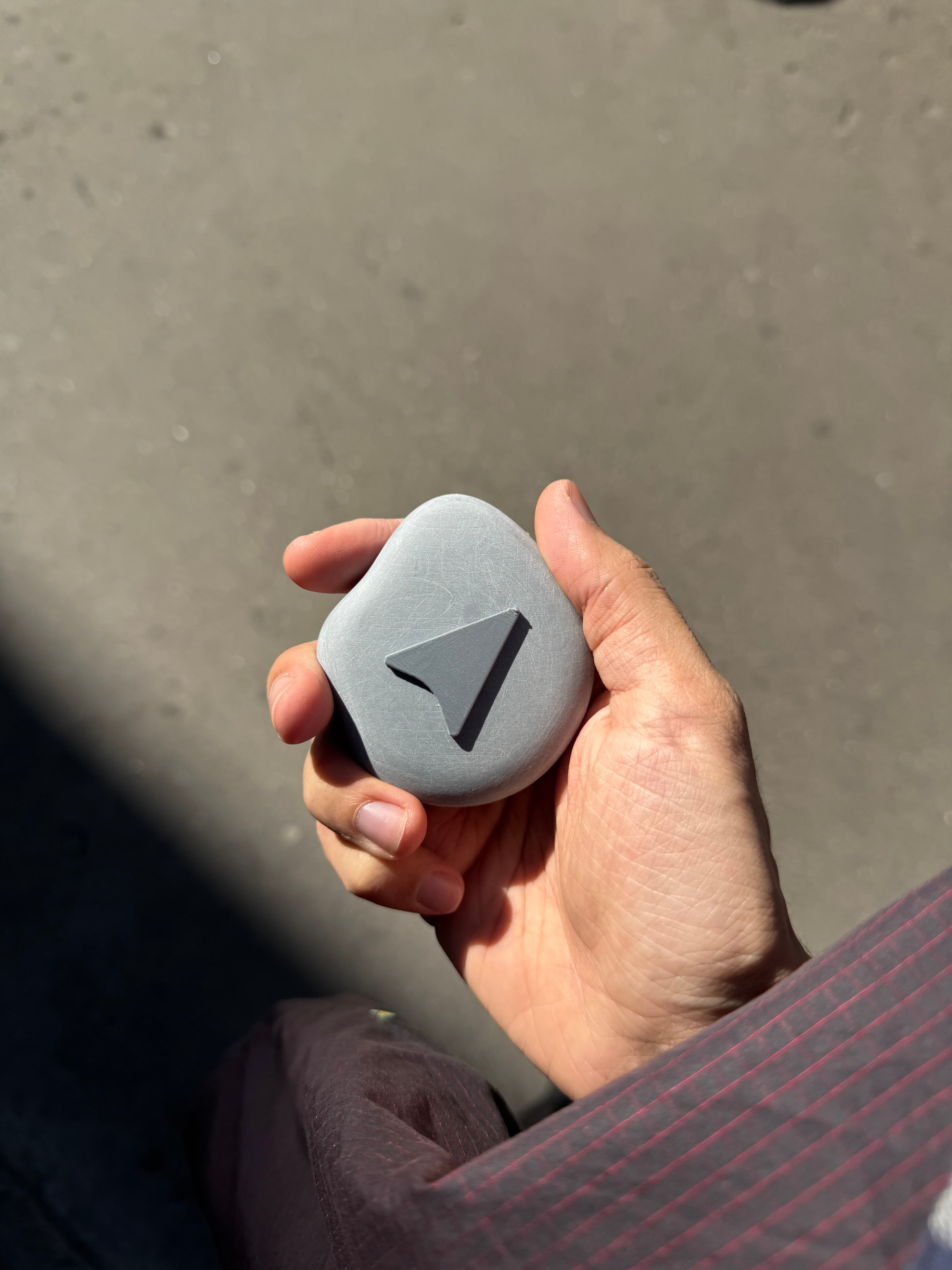
The object lives in the hand. So the general shape has to fit it. A form around the cylinder, into the palm — a pebble.
But too smooth. No direction of its own. Tim Ingold writes that we don’t perceive space as a flat surface but as a network of paths and directions. The shape needs to lean somewhere.
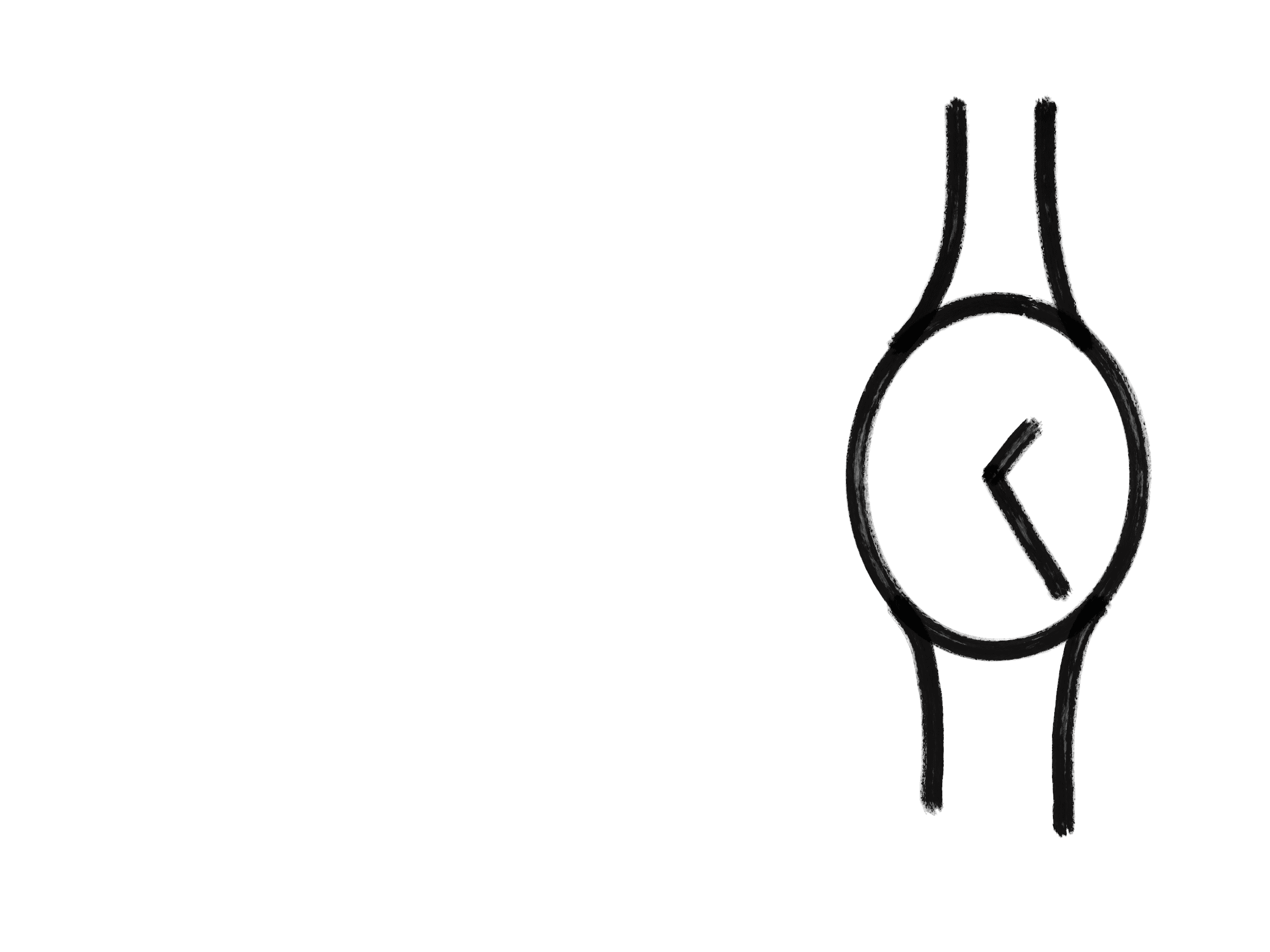
A compass — asymmetric, leaning. Hand and pebble, three contact points. Where it bothers me, I draw. I press on those spots as if the form were soft.
A first shape emerges. Too manifesto-like. Too talkative. I rationalize. I add a finger groove. A second one. In the end I come back to the very first shape, but with better curves.
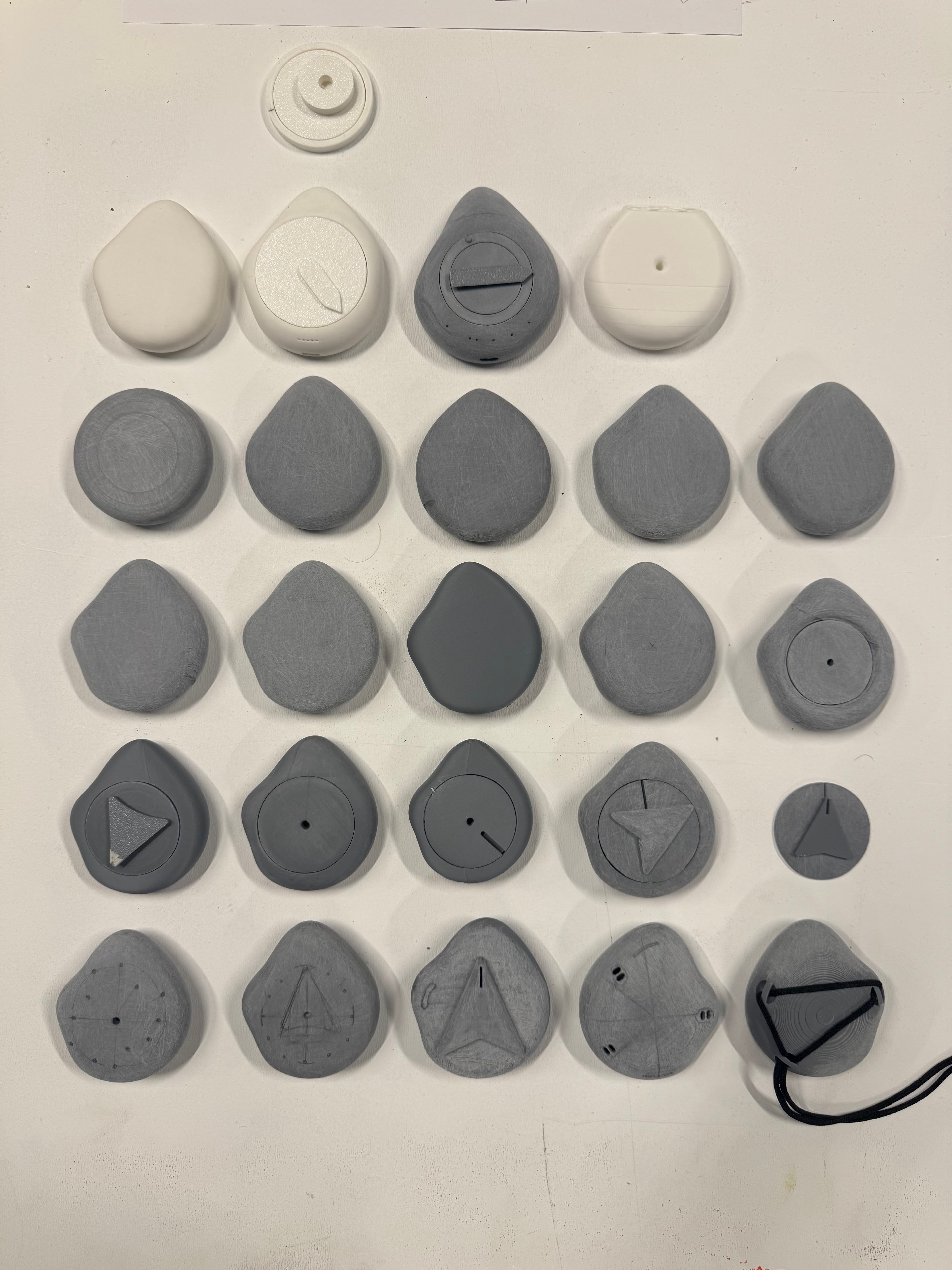
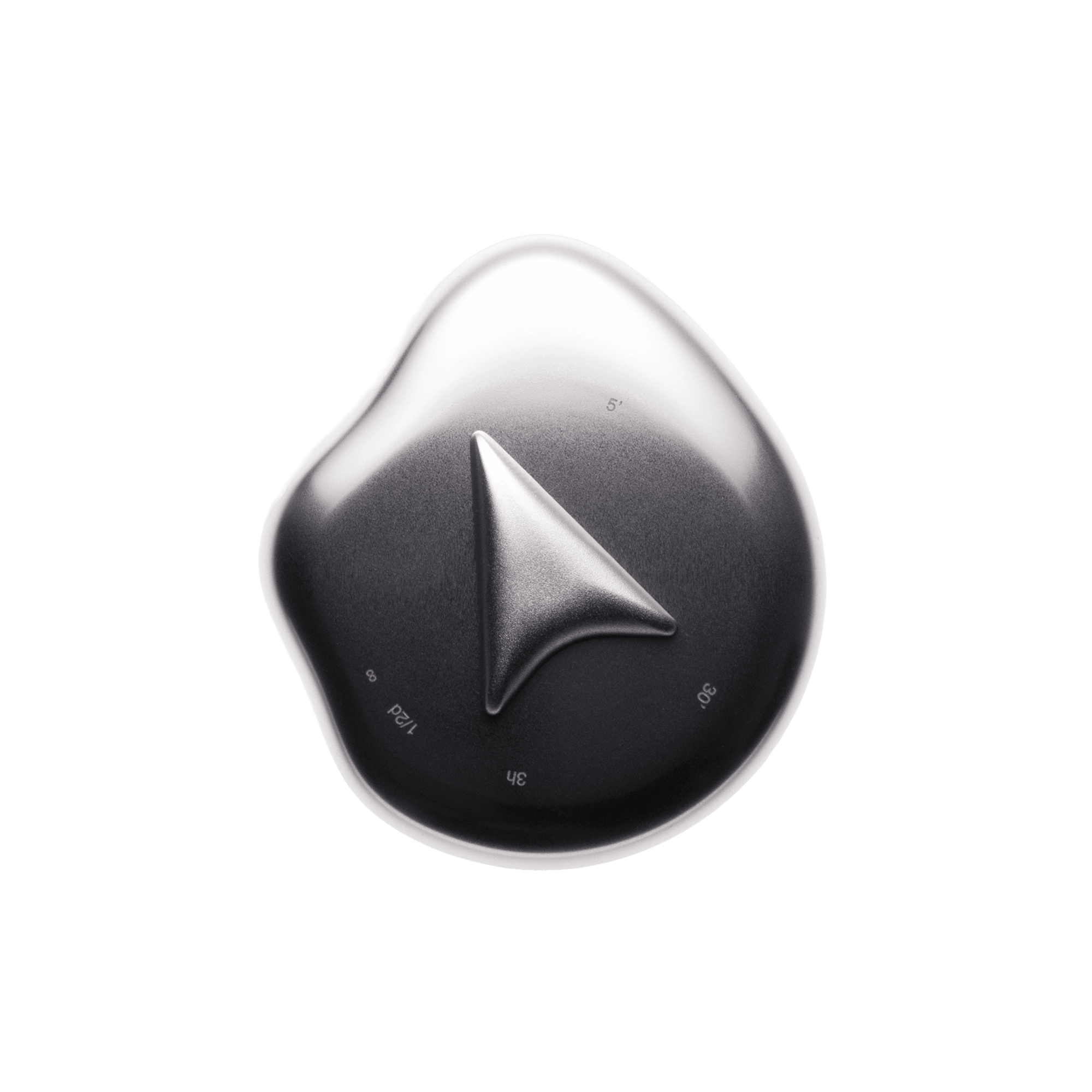
Hand, arm, shoulder. The whole body adjusts to face the direction. Asymmetry humanizes — personifies — like a starfish growing forward. And it gives the appearance of direction. Because any angle can become a direction.
A continuous asymmetric form, but it has to end in a perfect circle, to host the needle. The challenge: joining a freeform shape with a perfect circle.
To draw it, I mixed tools that aren’t supposed to work together. Blender. Rhino. Plasticity. Fusion. A recipe rather than ingredients.
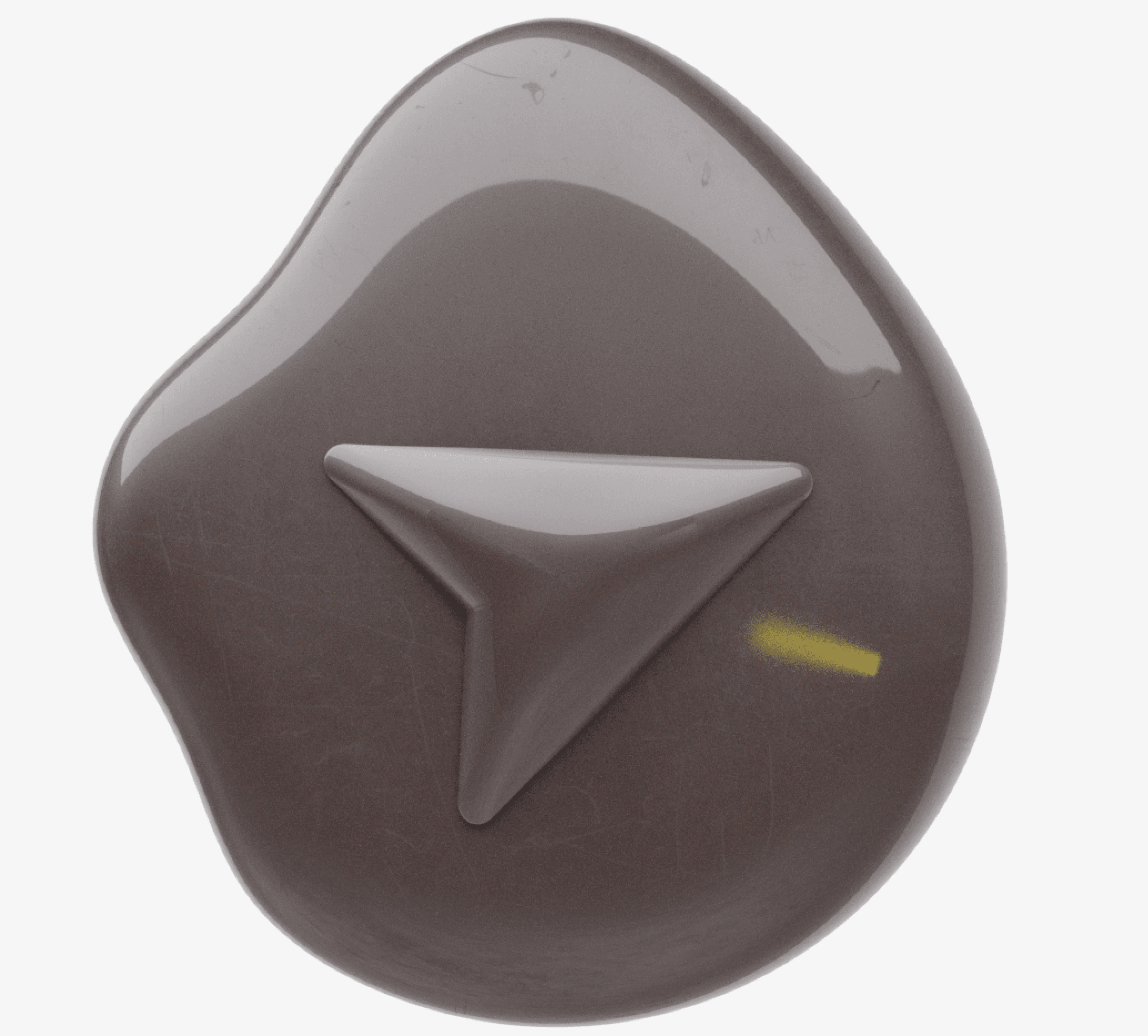
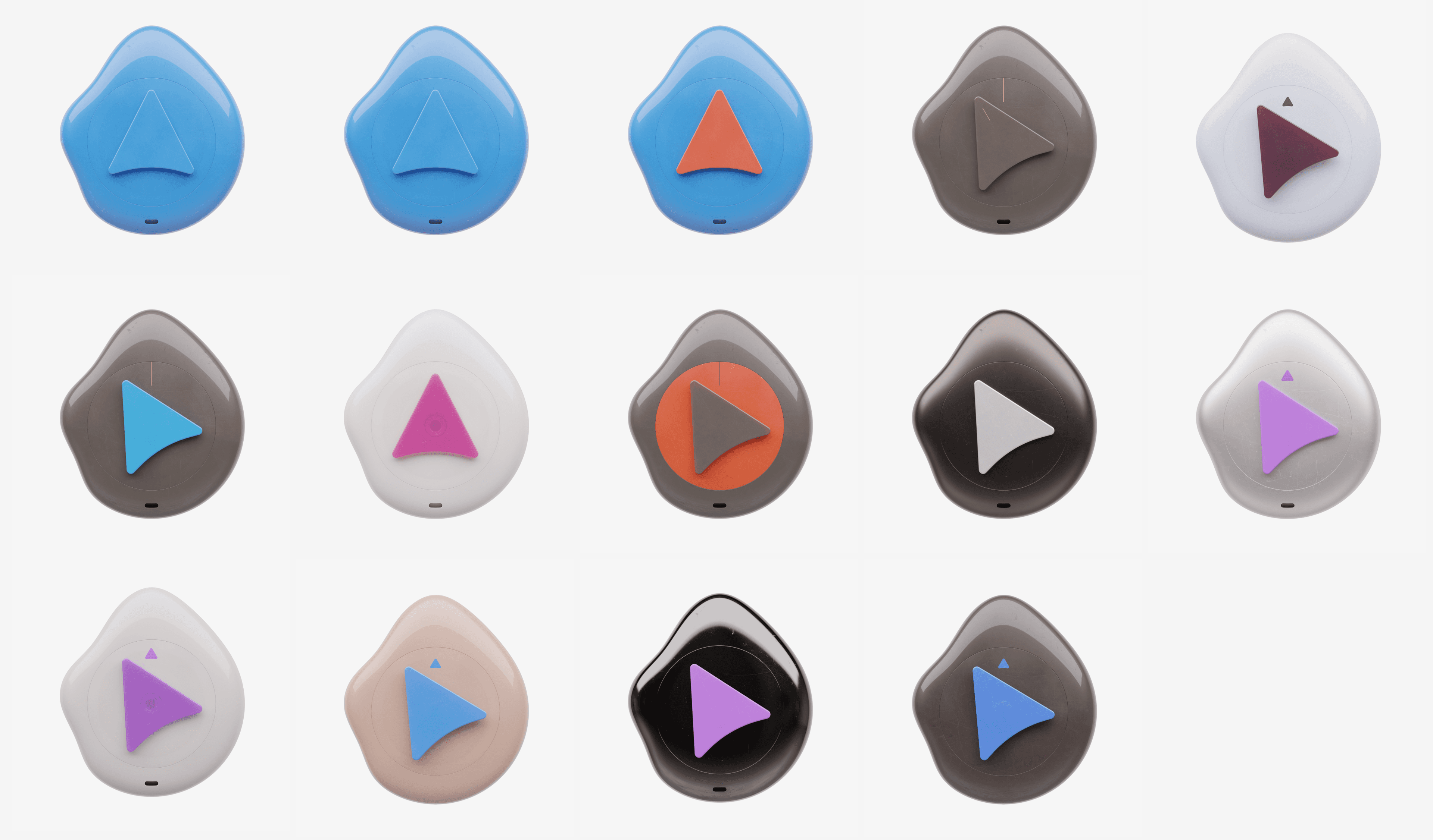
Technical signs banished from the front. I want to free up legibility. One glance, you know where to go. One arrow, that’s it.
Two layers of information that I gave up on — keep one line, one arrow is enough.
I tried other treatments for double information. All the way to the heresy of putting an LED on it. That sent the object somewhere else entirely. No longer touchable.
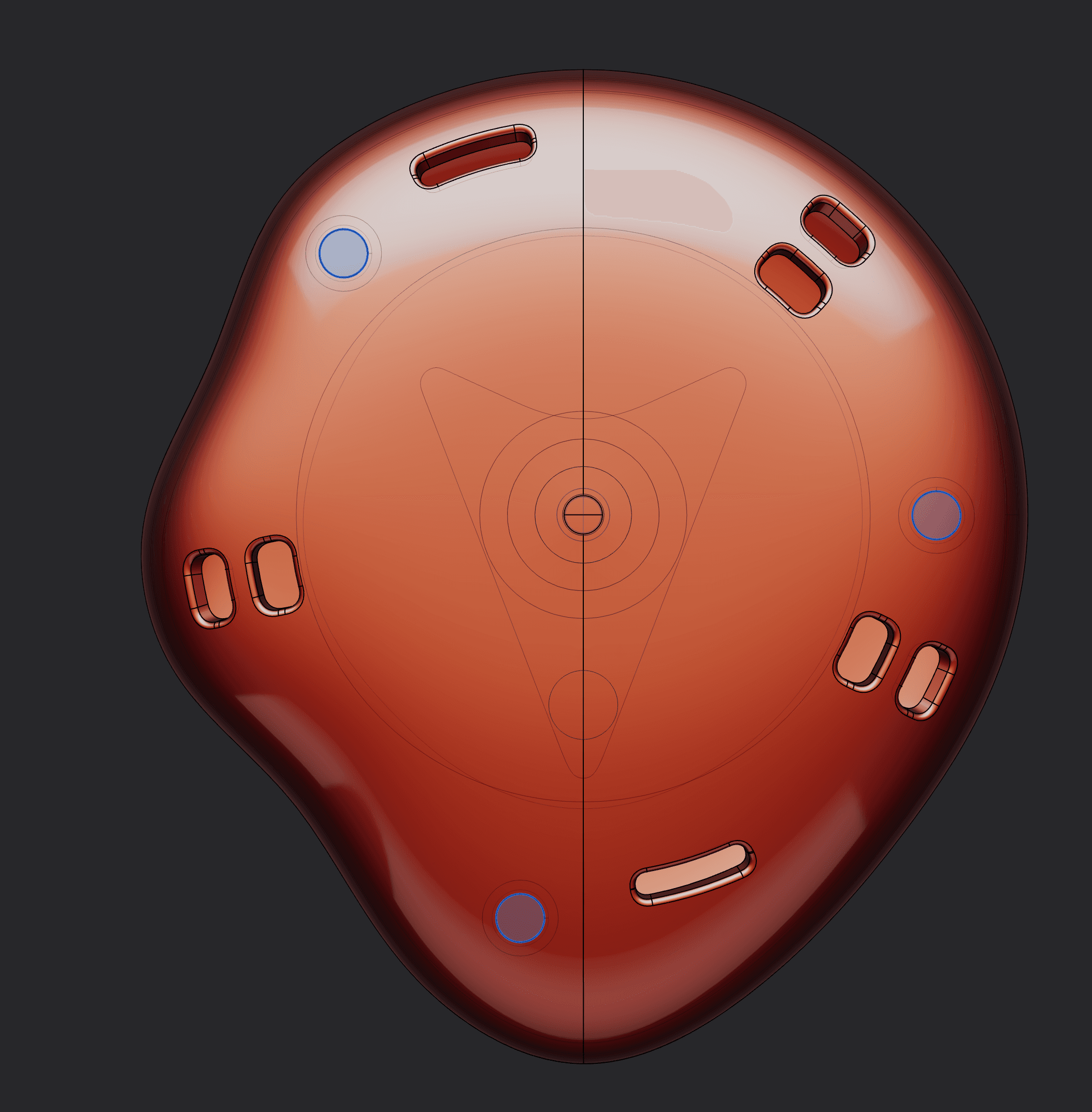
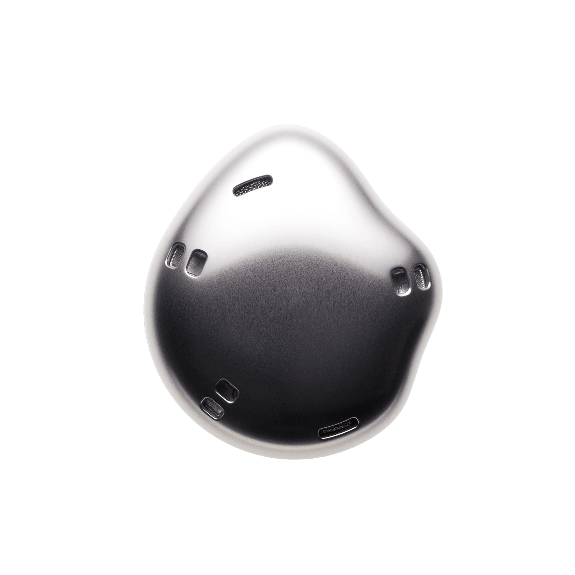
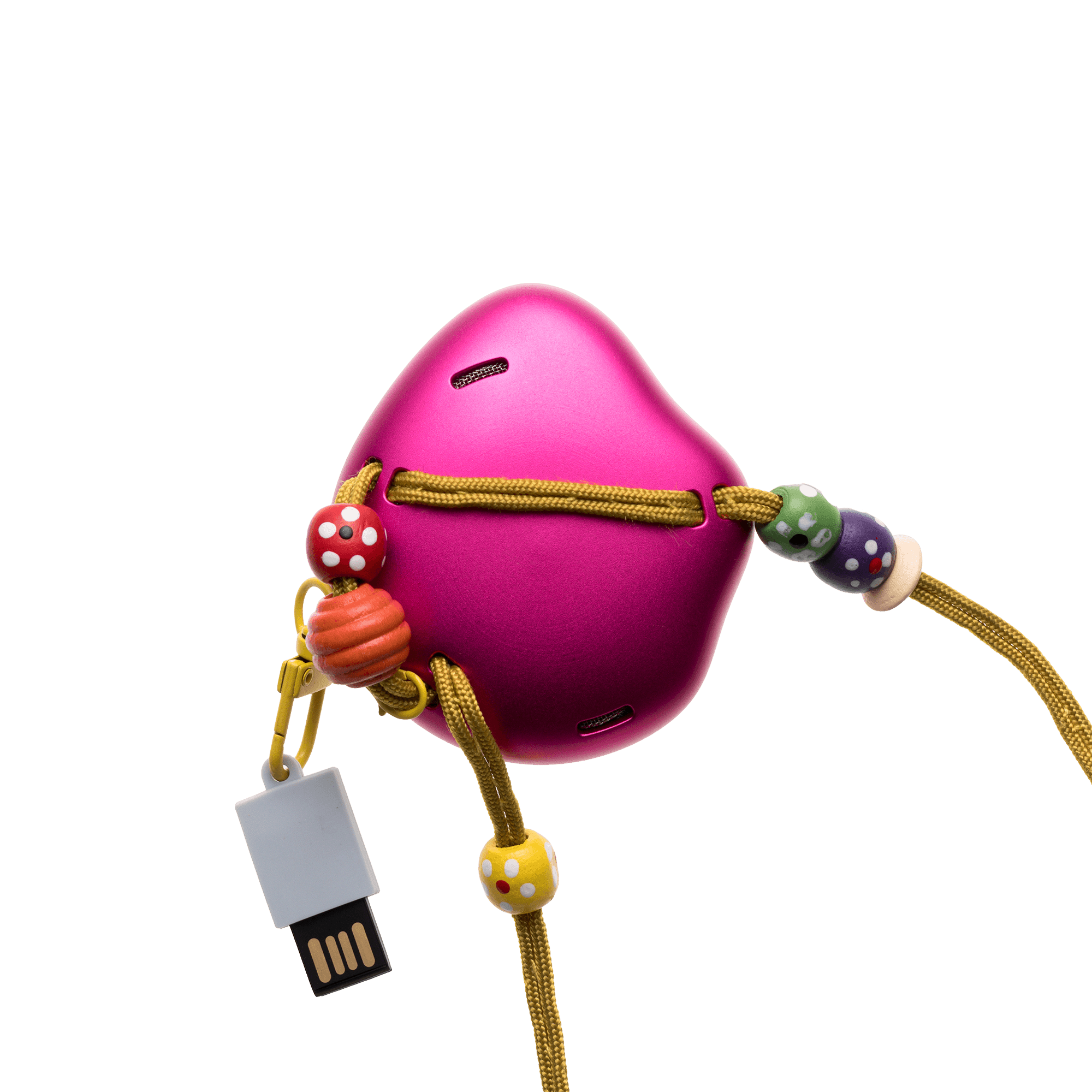
Same treatment for the USB-C port and the front-facing microphones. Realistic, but a designer’s vanity. I removed them with magnetic induction charging — a moving object, easy to grab.
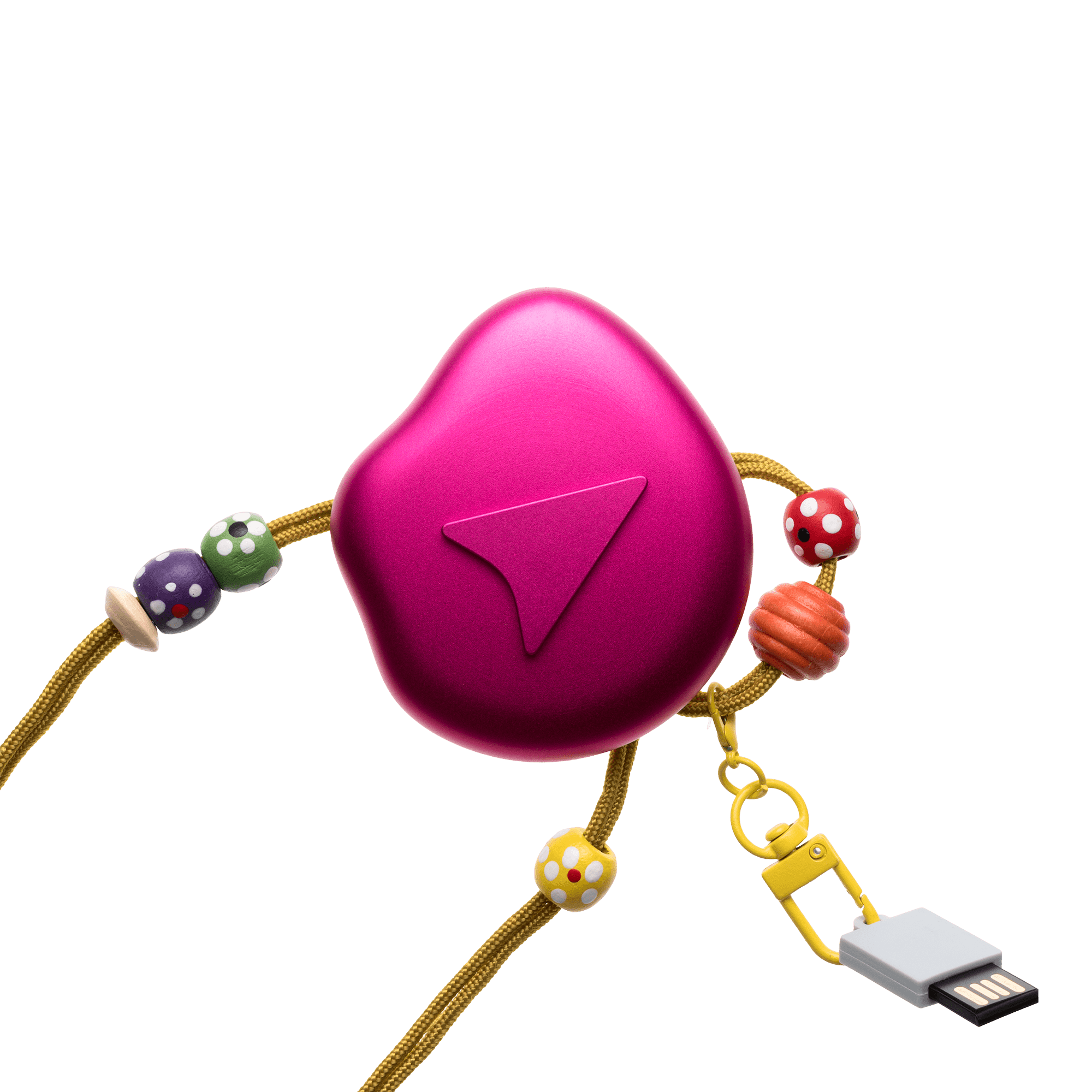
On the back, two microphones, well placed. Other holes let you attach a cord, a bracelet, or anything else. The hand first, then accessories. Other people could think those up.
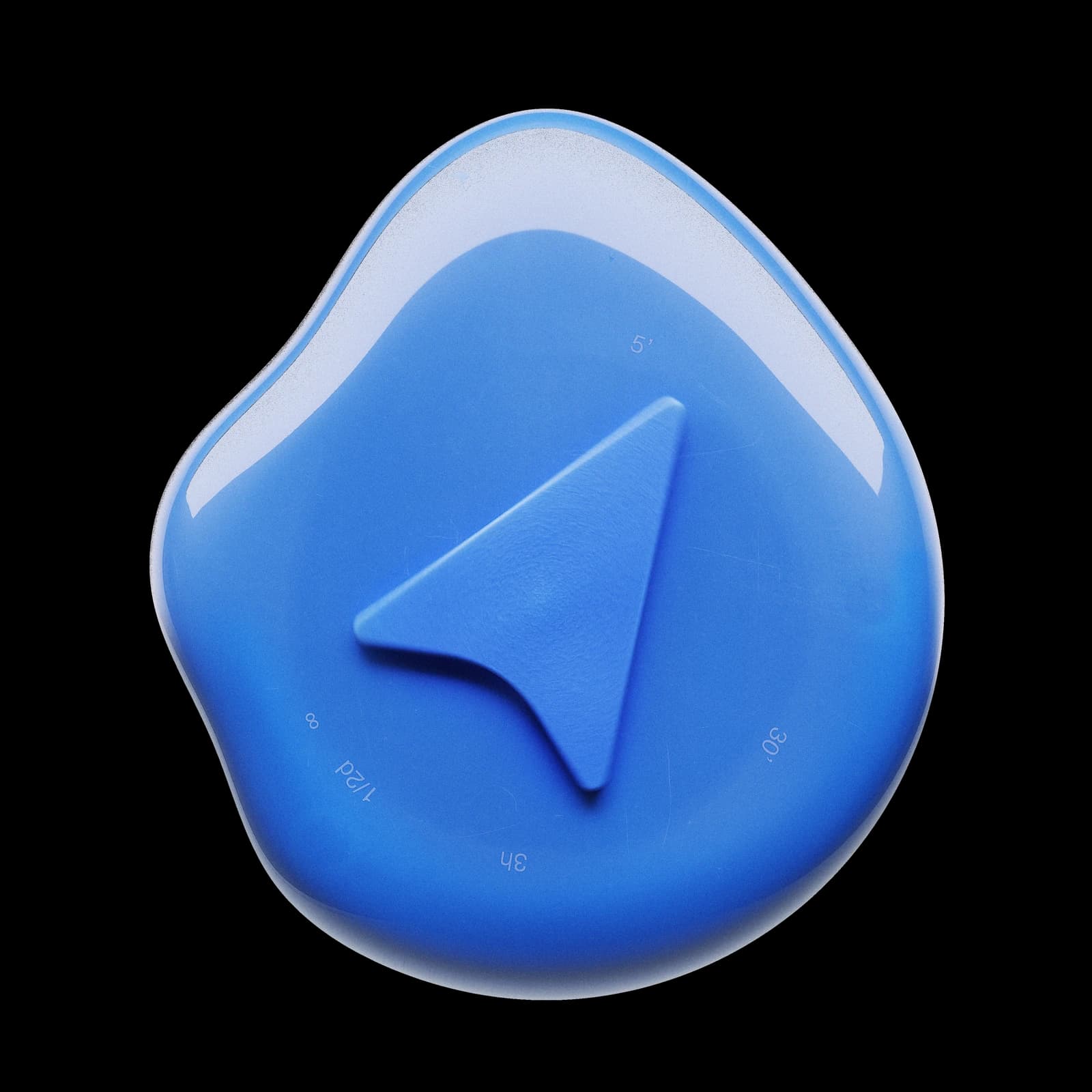
The most important sign on the object. The arrow.
To signal the software working underneath — I draw an arrow. The sign used by every navigation app. It’s also a diagram of the human gaze: two lines crossing at a single point, a marker, motion.
To better hybridize with the object, the final arrow follows its curves. Its general line, and the back of the arrow follows the front of the housing.
It looks like it’s just resting there. To pull the needle out of the fragility, the preciousness, the glass that usually defines it. But for that, it can’t be on a motor.
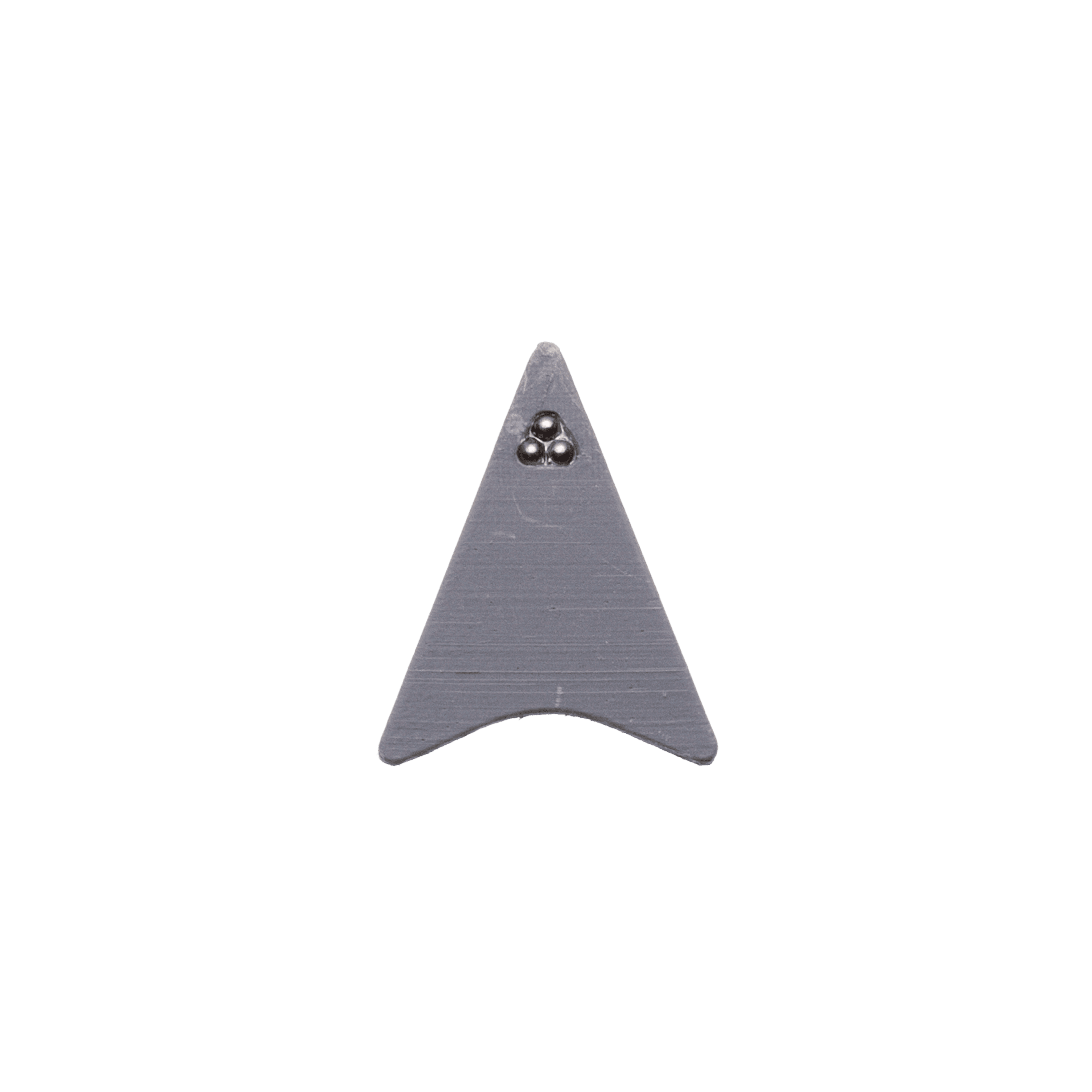
It’s pulled by a magnet. Analog behavior. Like a compass — but instead of pointing north, it points wherever you ask.
The magnet plate stays hidden underneath. So that the AI hybridizes completely with the object, it has to take form through silent movements.
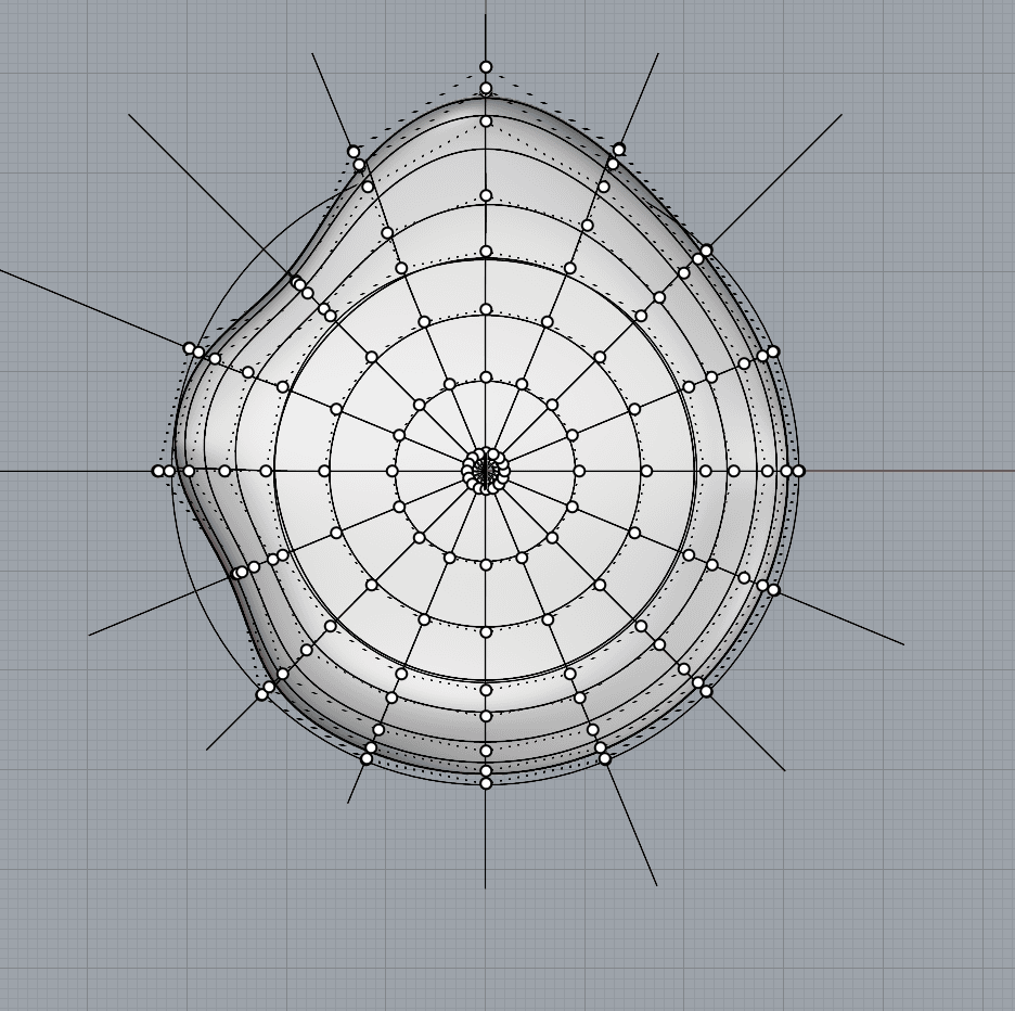
That’s how the language of the object came to be. A diagram lists every possible state, but you really see them in motion.
Too long. So let me show one specific path:
A slow rotation across the four cardinals — I’m listening, ask me. The arrow bugs across directions. I press it. Cardinals again. The needle locks into a fixed position — the answer. Arrival: a vibration. Yes. No.
To get the movements right, this would deserve a tolerance engineer. Magnets, axes, all of it. And a character designer from Miyazaki or Disney — someone who can transmit emotions with very little. Anime characters with two mouth shapes that somehow convince us they’re speaking. Saying so much, with so little.
After a trip — successful or not — you can open a companion app. It only shows what you’ve already done.
A journal. A spatial autobiography. Just text. Requests, places, traces.
A map, but completely empty. It draws itself as you move. Inviting you to explore further.
Later, you can share your traces. Follow someone else’s. Walk to Gilles’ fishmonger every Friday.
I want to talk about one component. Maybe the most important one.
The 9-DOF. Already striking on its own — small, purple, with a hand-shaped logo. Degrees of freedom. A magnetometer that’s already a compass in its own right. An accelerometer. A gyroscope. It locates the object in space.
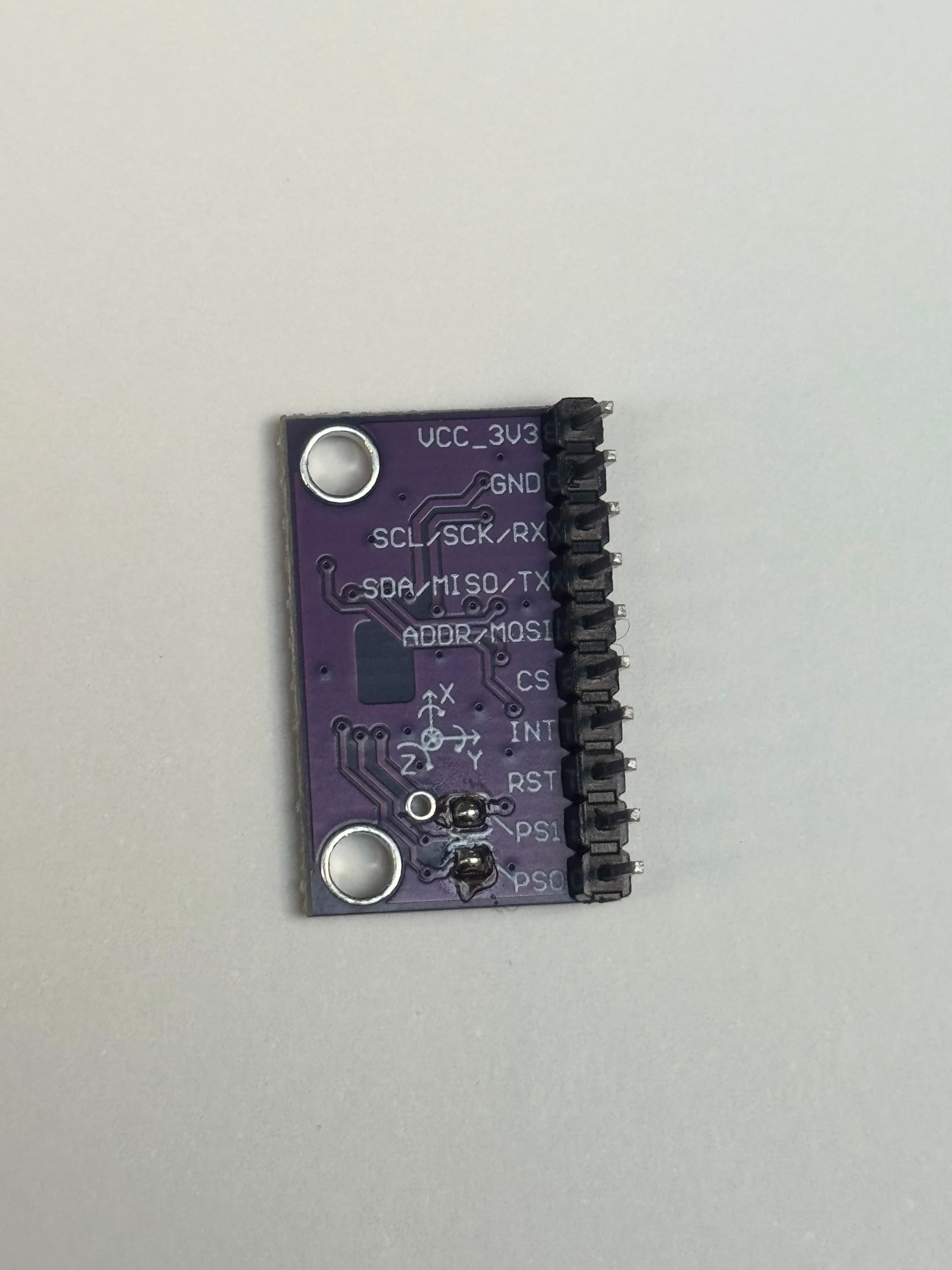
It’s everywhere — phones, VR headsets. We just place it inside this object, dedicated to one thing.
I’ve said it often: touch matters. So I produce in real materials.
Two classic materials of mass production: aluminum and plastic. I draw thinking about manufacturing — so I work a lot in cross-section.
Small object meaning the details are actually big. The parting line, where assembly happens, I hide as much as I can. Same with the inputs at the back. Microphone, holes for cord or anything else. Inside, a shoulder, and inserts to align the two halves.
I like the aluminum ones. They carry the warmth of a hand and keep it.
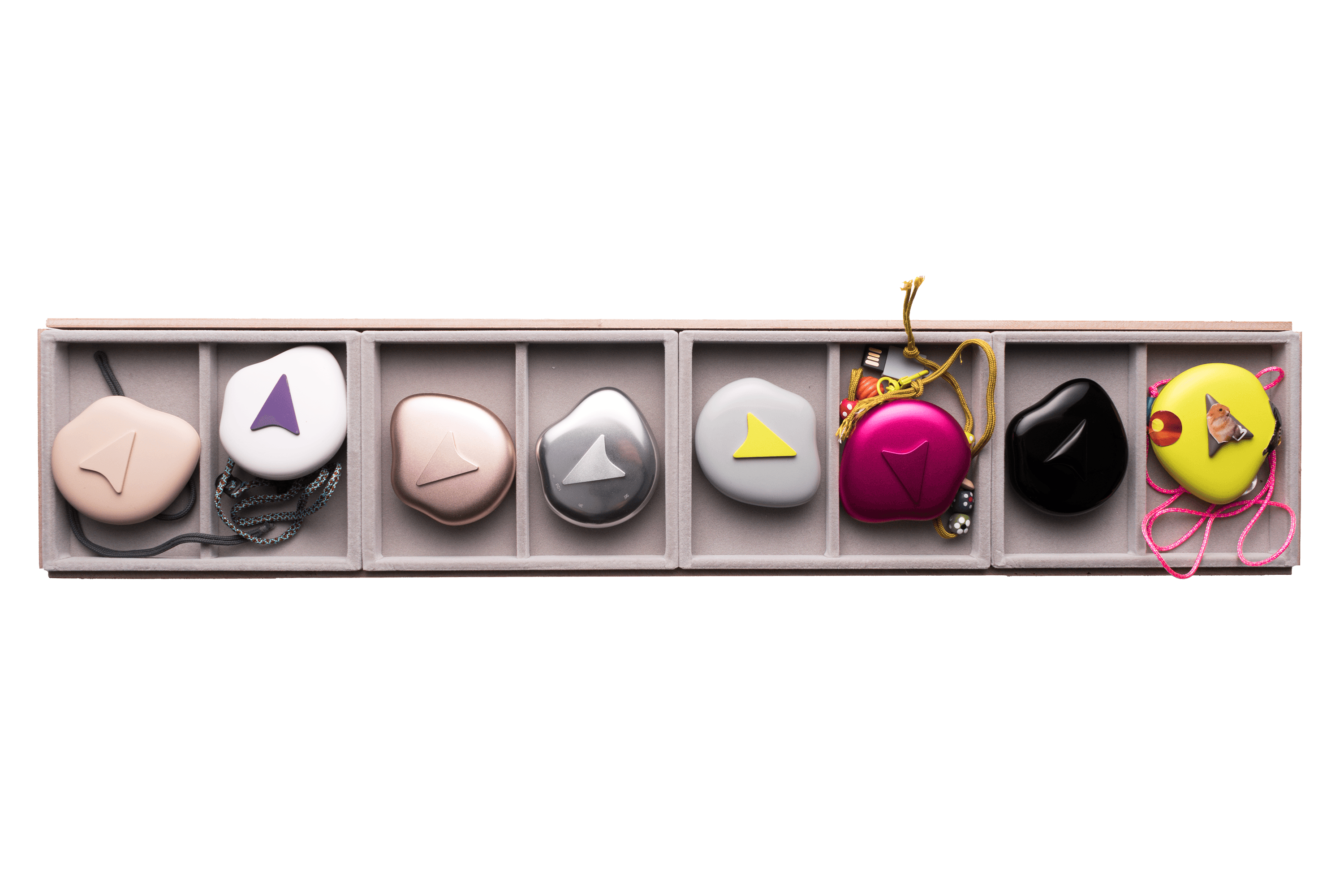
Finishes and colors matter for legibility.
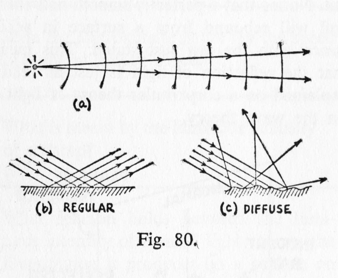
Glossy black aluminum. Absorbs the world around it, reflects only faintly. So you end up looking around. The light catches the plump arrow — letting you read it even tone-on-tone.
The opposite: matte rubber. A tactile object. Maybe you don’t even need to look at it. Just feel it to find your way.
Or this one — fluorescent matte on a glossy housing. Effective.
Each finish is a different way of being held.
I don’t want to conclude — not while the object is still unfinished.
I just hope it makes people want to explore. The way I’m exploring as I make it. The way I’ll keep exploring once it’s done.
Special thanks to Laurent, Sylvain, Marcelline, Benjamin, Paul, Zakine, Milo, Gaspard, Nino, Maxime, Claudia, Inès, Ferdinand, Adèle Collard, Adèle, Alanys, Sacha, Matei, Gaël, Simon, Marin, Gilles, Élodie, Bruno, and Minkyung.